Why Your Product Quiz is NOT Converting Well
When the numbers won't move, the worst thing you can do is change things at random. A quiz can fail at three separate points, and the fix for each is completely different. Find the stage that's leaking first, then work on that one.
Which stage is yours?
Open Quiz Metrics & Analytics and compare three numbers: how many people who see the quiz start it, how many starters finish, and how many finishers buy. The weakest of the three is your leak. Fix that stage before you touch anything else.
Visibility
If your quiz views are low, the content isn't the problem. Shoppers simply can't find it. The most successful quizzes appear in two or three places at once, so a customer runs into the quiz wherever they are in their visit.
Publish it in more than one place. A quiz buried on a single page gets almost no traffic. Add it as an inline block on your homepage, a floating button that follows shoppers as they browse, and an automatic popup for first-time visitors. Each placement catches a different moment in the journey.
How to publish your quiz
See: How to Publish Your Quiz. For the full placement playbook, see How to Get More People to Take Your Quiz.
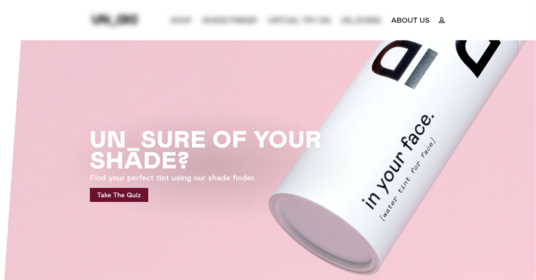
Name it for the outcome, not "Quiz". A button that says "Quiz" gives nobody a reason to click. Name it for the result the shopper gets, like "Find Your Perfect Routine" or "Shade Finder," and pair it with a CTA that promises that result. The name shows up in your buttons, menu links, and popups, so it is often the first thing a customer reads.
Send your paid traffic to the quiz, not the catalog. Where you send an ad click decides how hard your budget works, and that matters more every year as acquisition costs climb. Shoppers who finish a quiz order at roughly 2.75x the rate of a typical store, so routing ad traffic into the quiz instead of a category page earns more from the same spend.
Find your best traffic sources, then double down
Connect GA4 and the Meta Pixel so you can see which sources actually convert through the quiz, and put more budget there. The full play is in Use Quiz Data to Lower Your Ad Costs.
Completion
High starts with low completion almost always means the questions are the problem. A few changes recover the shoppers who are abandoning mid-quiz.
Keep it to six to twelve questions. Completion drops sharply past twelve questions, with seven or eight the sweet spot. Read every question and cut any that wouldn't change the recommendation. If different shoppers genuinely need different questions, use skip and jump logic to shorten each person's path rather than making everyone answer everything.
Cut questions shoppers can't answer confidently. If a shopper has to stop and think, or guess, they leave. Test the quiz on someone who doesn't know your products and watch where they hesitate, then rewrite or remove whatever trips them up. Where the answer is genuinely visual, like a shade or a skin type, a picture question removes the guesswork. Most quiz traffic is on phones, so keep questions short and tappable and lean on pictures over long lines of text.

Limit each question to three to six choices. More than six options is decision fatigue; fewer than three can't personalize the result. Keep every question inside that range, and split or combine options when you drift outside it.
Promise a reward on the welcome slide. Shoppers finish what they start when there's a payoff waiting. State it on the welcome slide, like "finish for your personalized routine and 10% off," and show a progress bar so the end always feels close.
Let Quiz Copilot draft the wording
Deciding which questions to keep and how to phrase them is the hardest part of quiz building, and it's exactly what Quiz Copilot is for. It can draft questions, rewrite clumsy answer choices, and generate results-page copy in seconds, which beats staring at a blank question and guessing.
Purchase
This is the most common problem, and the most fixable. The quiz did its job; the results just didn't close the sale.
Map every answer to a product. This is the single most common cause of low conversion. If your answer choices aren't tied to products or collections, the recommendation engine has nothing to work with, so it returns generic results that don't sell. Go through the quiz one answer at a time and confirm each choice pushes the recommendation somewhere.
How product mapping works
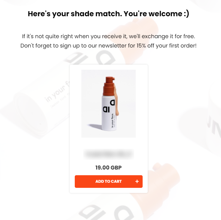
Keep the results page focused. Recommend one to three products, or one per slot for a routine, with one-click add-to-cart. A wall of ten options just hands the choice back to the shopper, which is the problem the quiz was meant to solve. Our data is clear on this: quizzes with a single results page average 10.6% conversion, against 7.1% for quizzes with eleven or more. If you sell anything consumable, offer a subscription on the results page so the first sale becomes a recurring one.
Capture the email and follow up. Most shoppers don't buy on the first visit, so the follow-up is where much of the revenue comes from. Add a required email question before the results, connect Klaviyo or your CRM, and send the first email within minutes with the recommendation and a discount. Quizzes connected to Klaviyo convert 24% better and generate 66% more orders on average.
Zero-party data is worth more in 2026, not less
As third-party cookies disappear, the data a quiz collects becomes your most durable targeting asset. Every answer is declared, consented data you own, and it powers segmented email and on-platform retargeting that keeps converting long after the session. Tag the answers with Customer Tags and put them to work in your ads.
Add a discount to close the sale. Quiz finishers are warm, but a small reward removes the last hesitation. Add an automatic discount code on the results page, and mention it on the welcome slide so shoppers who abandon still have a reason to come back and finish.
How to add a discount
Don't judge the quiz on a seven-day window
About 1 in 5 quiz-attributed orders land more than 30 days after the quiz. If you measure quiz revenue on same-week sales alone, you'll under-credit it and risk cutting something that's actually working.
A quick diagnostic checklist
Work top to bottom, and fix the first thing that's missing before moving on.
☐ Published in at least two places on your store
☐ A name and CTA that promise a concrete result
☐ Six to twelve questions, starting with seven or eight
☐ Three to six answer choices per question
☐ Every answer mapped to a product or collection
☐ One to three products on a single results page
☐ One clear add-to-cart or shop-now button
☐ A required email question before the results
☐ A discount code on the results page
☐ A follow-up email within minutes, through Klaviyo or your CRM
Clear every box and most quizzes reach 10-15% conversion with no design changes at all.
Do / Don't
- Do diagnose before you tweak. Check the metrics to find which stage is leaking, then fix that one.
- Do map every answer to a product before touching anything else. Unmapped answers are the most common cause of low conversion.
- Do capture the email and follow up, because most shoppers don't buy on the first visit.
- Don't redesign the quiz as your first move. The fix is almost always mapping and follow-up, not fonts.
- Don't add questions or products to "help." Fewer, well-mapped questions and a short recommendation convert better.
Frequently asked questions
Why isn't my quiz converting?
Find the stage first. Low starts is a visibility problem, low completion is a question-design problem, and low purchase is a recommendation or follow-up problem. The fix is completely different for each.
What's the most common cause of low quiz conversion?
Unmapped answer choices that produce generic recommendations. Map every answer to a product or collection before anything else.
Do I need to redesign the quiz?
Usually not. Mapping the answers and adding an email follow-up fixes most quizzes without a single design change.
Need help diagnosing your specific quiz? Get in touch with our support team and we'll take a look.
Related articles: