Quiz Builder - Questions
Questions
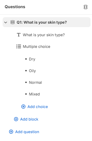
Λ / V - Click to expand or collapse all the questions in the quiz at once.
↔ - Click to expand the questions and choices in a horizontal view.
+ Add choice - Adds an extra choice in multiple-choice questions. To remove a choice, click on the 🗑 bin icon.
+ Add block - Adds an extra building block to the quiz question. To remove a block, click on the 🗑 bin icon.
Info
All block elements added to a question are visible on a single slide. To add a new slide click + Add question.
+ Add question - Opens a menu of quiz questions to add as a new slide. To remove a question, click on the question and go to Question settings.
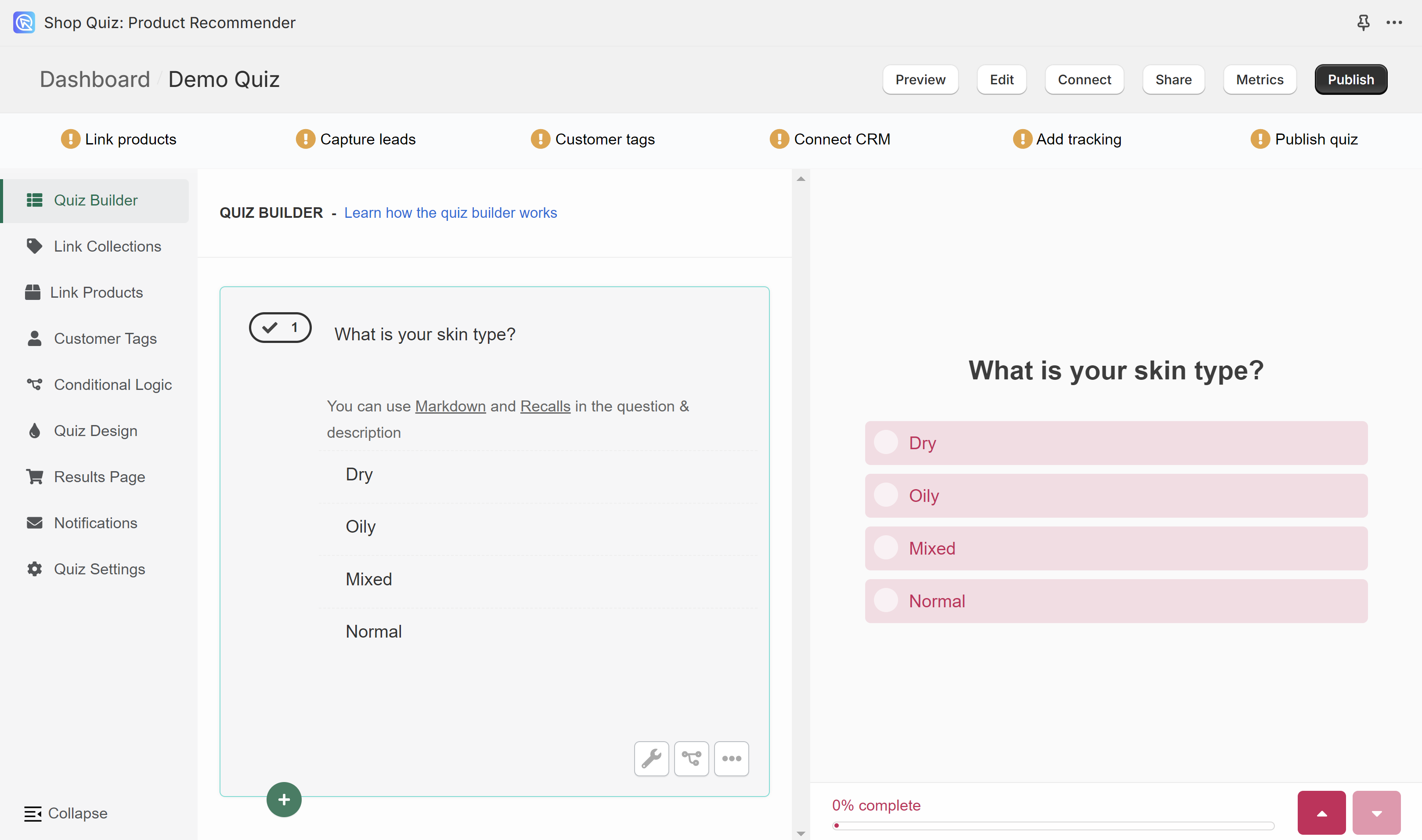
Quiz Builder is composed of two sections: the slides (left) and the preview (right). All the questions that you add to the quiz will be shown on the small preview. To test the whole quiz click Preview in the top menu.
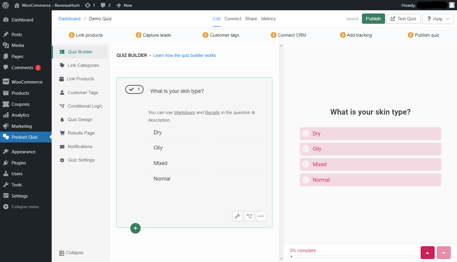
Quiz Builder is composed of two sections: the slides (left) and the preview (right). All the questions that you add to the quiz will be shown on the small preview. To test the whole quiz click Test Quiz in the top menu.
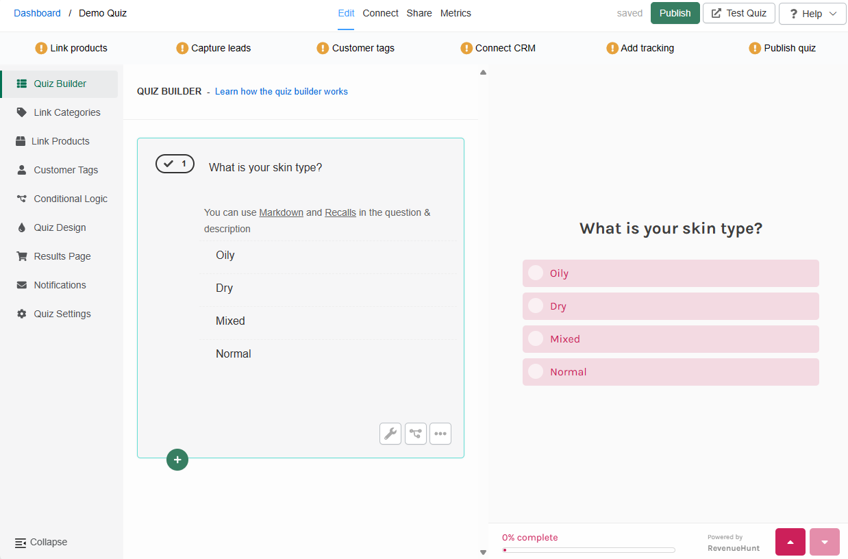
Quiz Builder is composed of two sections: the slides (left) and the preview (right). All the questions that you add to the quiz will be shown on the small preview. To test the whole quiz click Test Quiz in the top menu.
Quiz Builder is composed of two sections: the slides (left) and the preview (right). All the questions that you add to the quiz will be shown on the small preview. To test the whole quiz click Test Quiz in the top menu.
Quiz Builder is composed of two sections: the slides (left) and the preview (right). All the questions that you add to the quiz will be shown on the small preview. To test the whole quiz click Test Quiz in the top menu.
Quiz structure
A quiz is a sequence of questions, ending in a results page. Questions are modular: each one holds one or more blocks.
quiz
└── question          one screen of the quiz
    └── block         a component on that screen
        └── choice    an alternative inside a choices block
| Term | What it means |
|---|---|
| quiz | The whole thing: a sequence of questions ending in a results page. |
| question | One screen of the quiz. Adding a question type creates a question with the matching block already inside it. |
| question type | What the add menu offers. Choosing Email Address creates a question containing an email address input block. You can then add an image block above it. |
| block | A component inside a question. There are content blocks, choices blocks, input blocks and chart blocks. |
| choice | One of the alternatives a customer can pick inside a choices block. |
| slide | The name for a question in the API and in merge tags such as {{slide:ZMiXjj}}. |
A quiz is a sequence of questions, ending in a Results Page. A question holds its choices directly.
| Term | What it means |
|---|---|
| quiz | The whole thing: a sequence of questions ending in a Results Page. |
| question | One screen of the quiz. The question type determines what the customer sees and does. |
| question type | Multiple Choice, Pictures Choice, Dropdown, Yes/No, Short-text, Multi-line Text, Date, File Upload, Number, Name, Email Address, Phone Number, Legal Terms/GDPR, and the Welcome, Thank You and Statement messages. |
| choice | One of the alternatives a customer can pick. |
| slide | Another word for a question, used in the API and in merge tags. |
| block | A piece of content on the Results Page, such as a heading, a text block or a product block. |
A quiz is a sequence of questions, ending in a Results Page. A question holds its choices directly.
| Term | What it means |
|---|---|
| quiz | The whole thing: a sequence of questions ending in a Results Page. |
| question | One screen of the quiz. The question type determines what the customer sees and does. |
| question type | Multiple Choice, Pictures Choice, Dropdown, Yes/No, Short-text, Multi-line Text, Date, File Upload, Number, Name, Email Address, Phone Number, Legal Terms/GDPR, and the Welcome, Thank You and Statement messages. |
| choice | One of the alternatives a customer can pick. |
| slide | Another word for a question, used in the API and in merge tags. |
| block | A piece of content on the Results Page, such as a heading, a text block or a product block. |
A quiz is a sequence of questions, ending in a Results Page. A question holds its choices directly.
| Term | What it means |
|---|---|
| quiz | The whole thing: a sequence of questions ending in a Results Page. |
| question | One screen of the quiz. The question type determines what the customer sees and does. |
| question type | Multiple Choice, Pictures Choice, Dropdown, Yes/No, Short-text, Multi-line Text, Date, File Upload, Number, Name, Email Address, Phone Number, Legal Terms/GDPR, and the Welcome, Thank You and Statement messages. |
| choice | One of the alternatives a customer can pick. |
| slide | Another word for a question, used in the API and in merge tags. |
| block | A piece of content on the Results Page, such as a heading, a text block or a product block. |
A quiz is a sequence of questions, ending in a Results Page. A question holds its choices directly.
| Term | What it means |
|---|---|
| quiz | The whole thing: a sequence of questions ending in a Results Page. |
| question | One screen of the quiz. The question type determines what the customer sees and does. |
| question type | Multiple Choice, Pictures Choice, Dropdown, Yes/No, Short-text, Multi-line Text, Date, File Upload, Number, Name, Email Address, Phone Number, Legal Terms/GDPR, and the Welcome, Thank You and Statement messages. |
| choice | One of the alternatives a customer can pick. |
| slide | Another word for a question, used in the API and in merge tags. |
| block | A piece of content on the Results Page, such as a heading, a text block or a product block. |
A quiz is a sequence of questions, ending in a Results Page. A question holds its choices directly.
| Term | What it means |
|---|---|
| quiz | The whole thing: a sequence of questions ending in a Results Page. |
| question | One screen of the quiz. The question type determines what the customer sees and does. |
| question type | Multiple Choice, Pictures Choice, Dropdown, Yes/No, Short-text, Multi-line Text, Date, File Upload, Number, Name, Email Address, Phone Number, Legal Terms/GDPR, and the Welcome, Thank You and Statement messages. |
| choice | One of the alternatives a customer can pick. |
| slide | Another word for a question, used in the API and in merge tags. |
| block | A piece of content on the Results Page, such as a heading, a text block or a product block. |
Naming
For the word RevenueHunt uses for each of these, and how it differs by platform, see the Glossary.
Question types
+ Add question - Opens a menu of quiz questions to add. To remove a question, click on the question and go to Question settings.
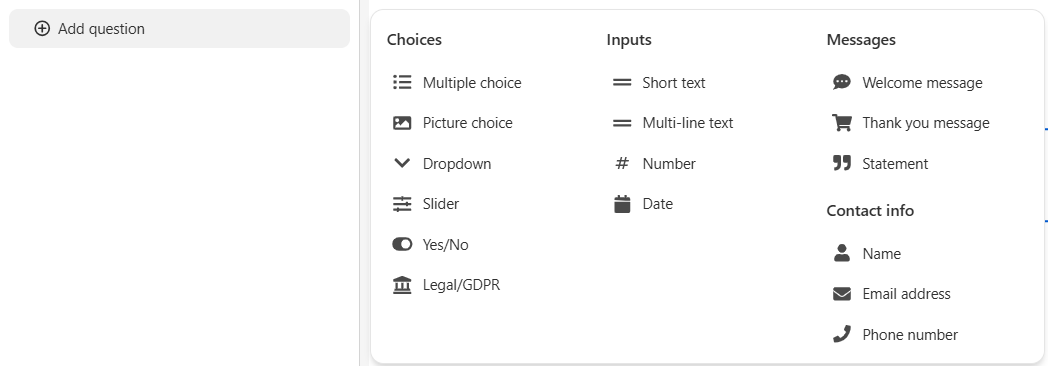
Contact info
Name - A slide designed for users to enter their name, featuring a short text field.
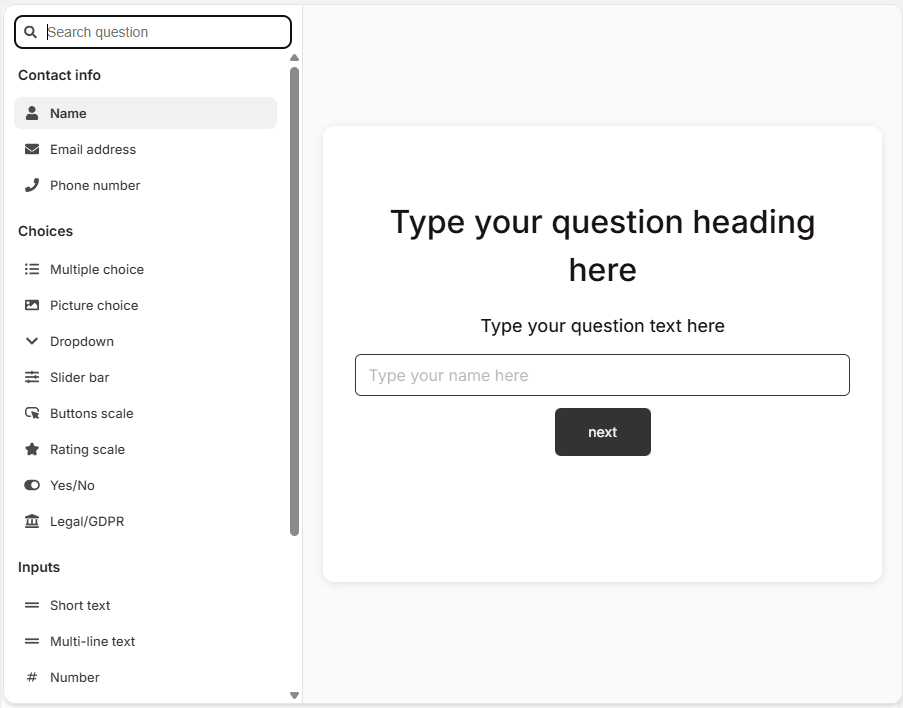
Email Address - A slide dedicated to collecting the user's email address through a text field.
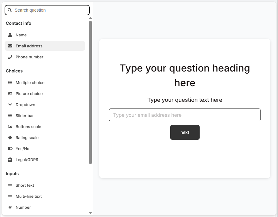
Phone Number - A slide where customers are asked to enter their phone number, usually in a specified format.
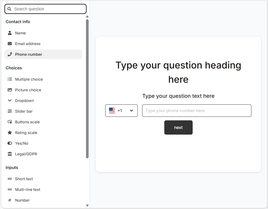
Choices
Multiple Choice - A question slide with several clickable options for selecting a single/multiple answers.
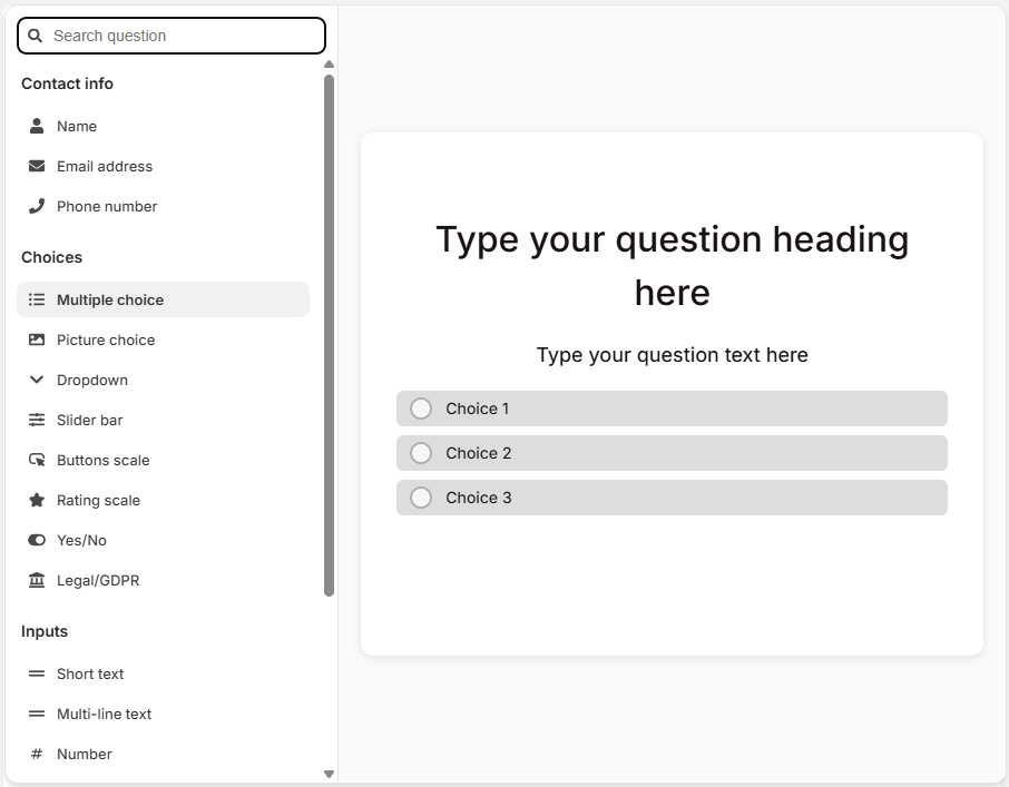
Pictures Choice - Multiple-choice slide which displays choices as clickable images. You can upload your own image to each choice. Square images are recommended, up to 400px by 400px.
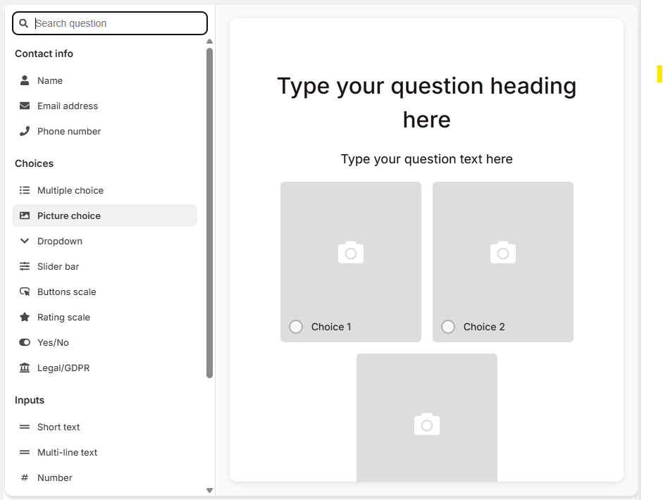
Dropdown - Multiple-choice slide which displays choices as a dropdown menu.
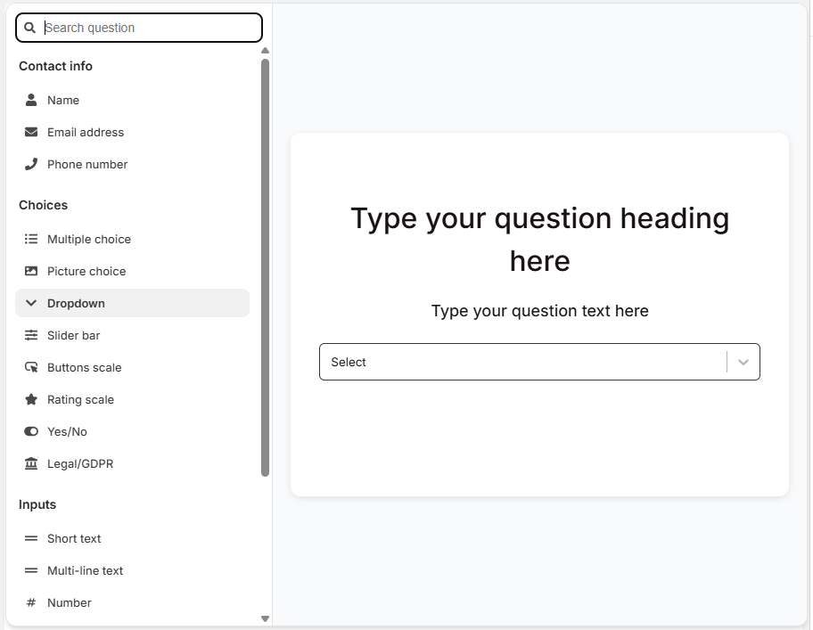
Slider bar - A question slide with a slider bar for users to select a value between options.
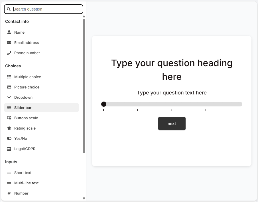
Buttons scale - A question slide with a scale of buttons for users to select a value between options.
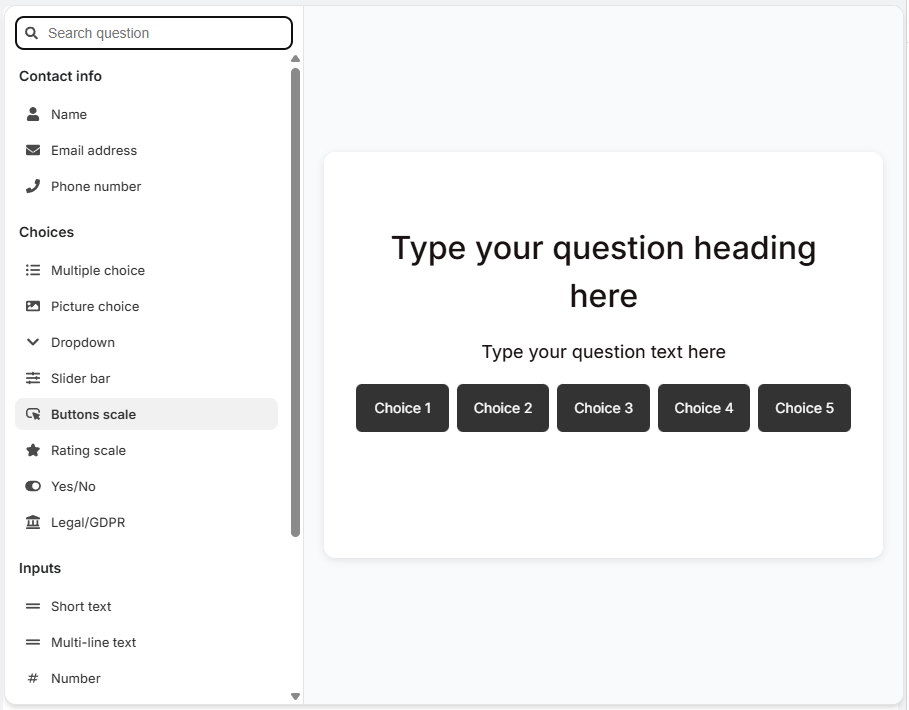
Rating scale - A question slide with a scale of stars for users to select a value between options.
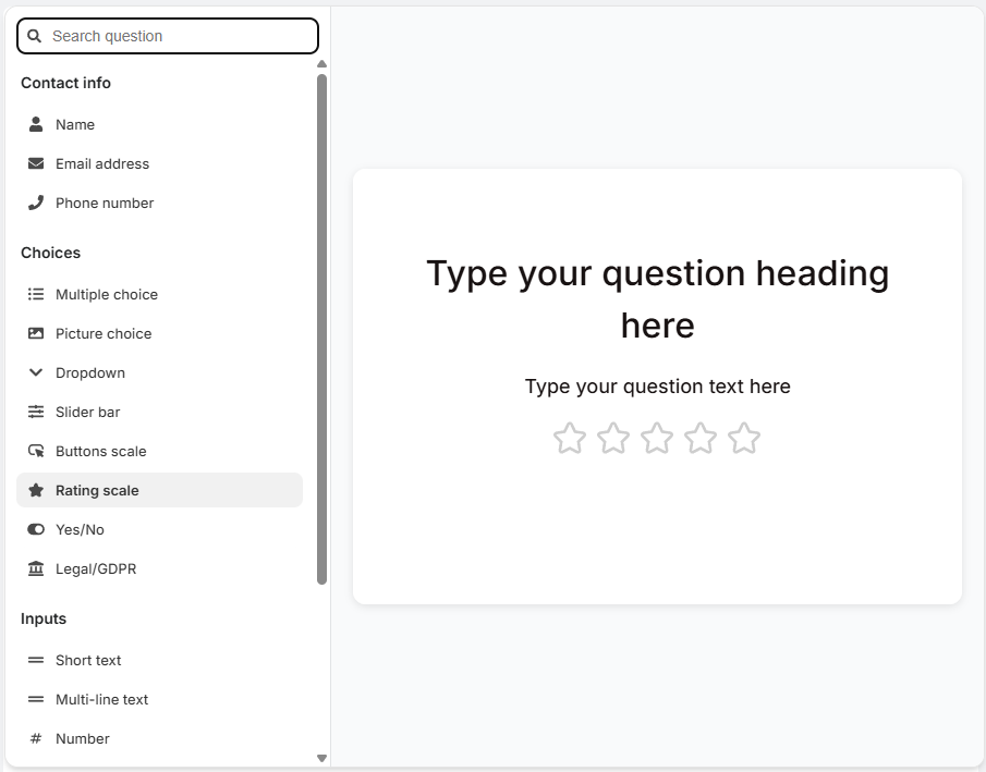
Yes/No - Two choices slide which displays choices as a clickable options.
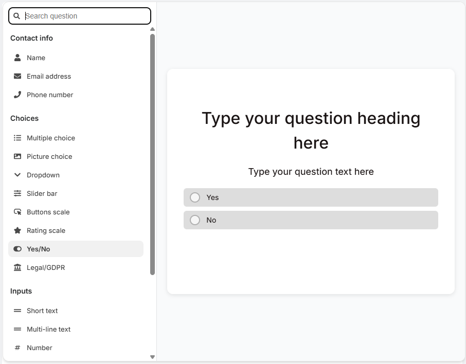
Legal Terms/GDPR - A slide presenting legal terms or GDPR-related information, with options to accept or decline through clickable buttons.
Inputs
Short-text - An open question slide where the customer types a short text answer.
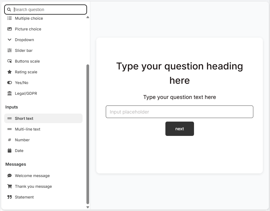
Multi-line Text - An open question slide where the customer types a longer text answer, over several lines.
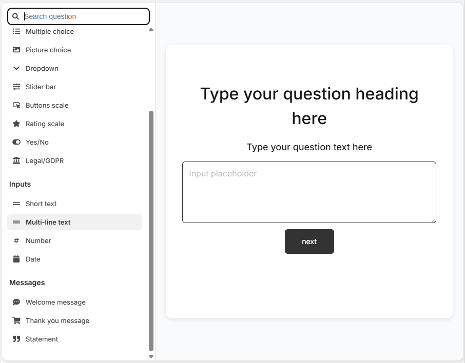
Number - A question type where users are prompted to input a numerical answer.
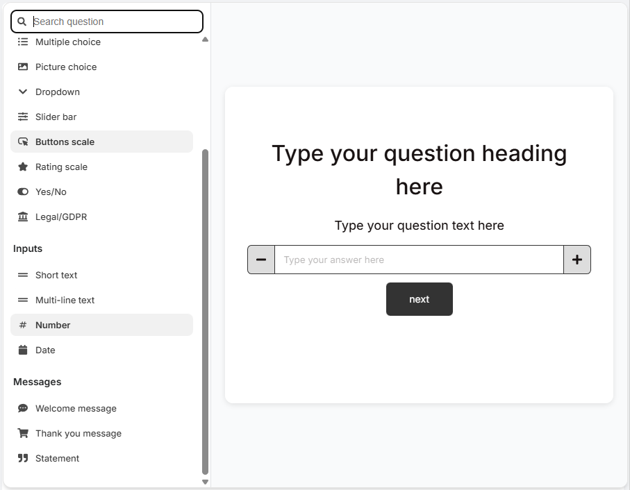
Date - A question slide that prompts the user to select or enter a specific date.
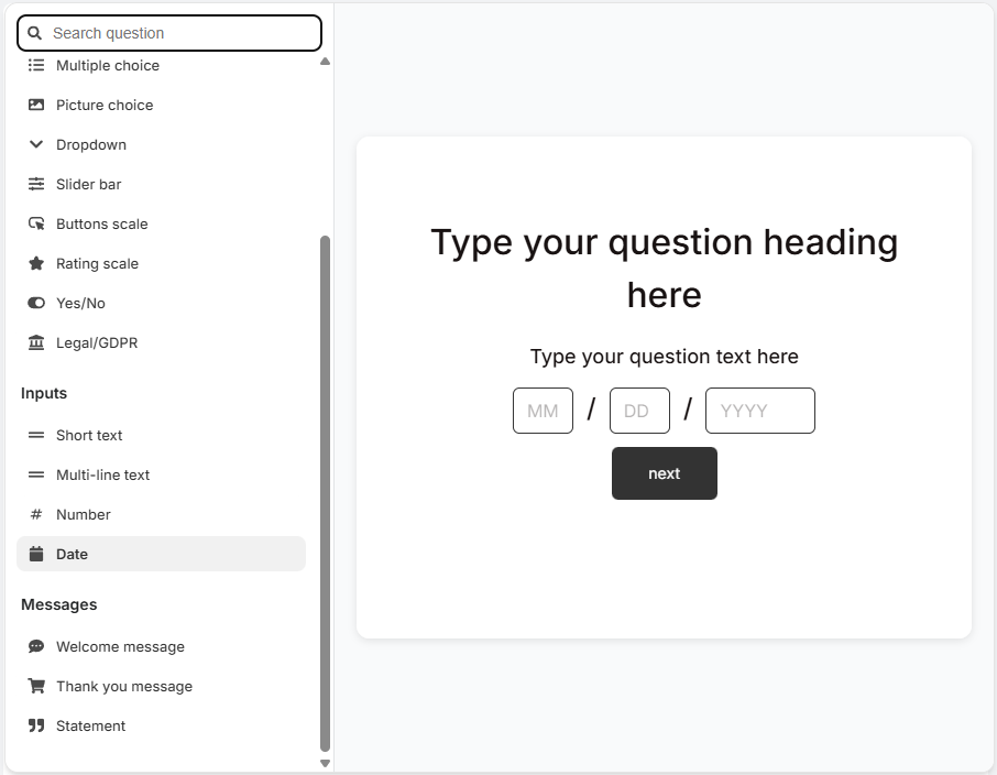
Messages
Welcome Message - The first slide in the quiz, also known as the welcome screen or welcome page. The introductory slide of the quiz featuring welcoming text and a 'Start Quiz' button. See how to add a welcome screen.
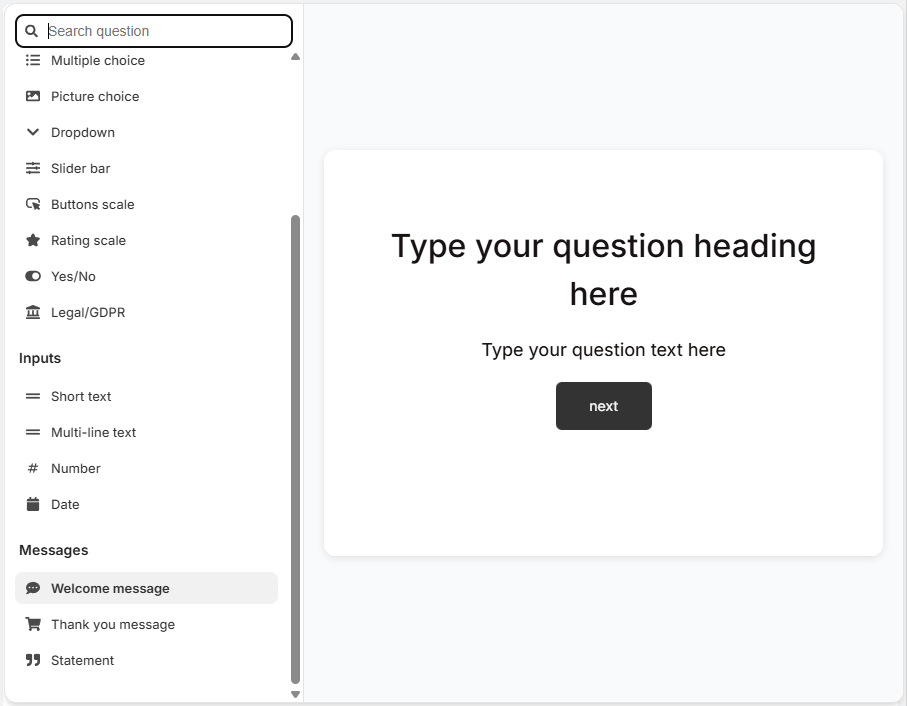
Thank You Message -The last slide in the quiz. The concluding slide of the quiz displaying gratitude text and a button to view quiz results.
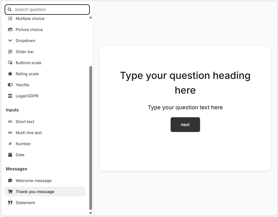
Statement - A statement slide which displays text and a button to proceed to the next question.
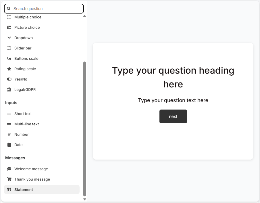
+/ Add new question - Opens a menu of quiz questions to add.
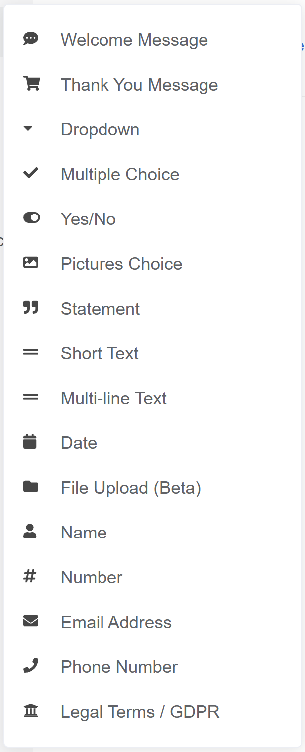
Welcome Message - The first slide in the quiz, also known as the welcome screen or welcome page. The introductory slide of the quiz featuring welcoming text and a 'Start Quiz' button. See how to add a welcome screen.
Thank You Message -The last slide in the quiz. The concluding slide of the quiz displaying gratitude text and a button to view quiz results.
Dropdown - Multiple-choice slide which displays choices as a dropdown menu.
Multiple Choice - A question slide with several clickable options for selecting a single/multiple answers.
Yes/No - Two choices slide which displays choices as a clickable options.
Pictures Choice - Multiple-choice slide which displays choices as clickable images. You can upload your own image to each choice. Square images are recommended, up to 400px by 400px.
Statement - A statement slide which displays text and a button to proceed to the next question.
Short-text - An open question slide where the customer types a short text answer.
Multi-line Text - An open question slide where the customer types a longer text answer, over several lines.
Date - A question slide that prompts the user to select or enter a specific date.
File Upload - An interactive slide where users can upload a file as their response.
Name - A slide designed for users to enter their name, featuring a short text field.
Number - A question type where users are prompted to input a numerical answer.
Email Address - A slide dedicated to collecting the user's email address through a text field.
Phone Number - A slide where customers are asked to enter their phone number, usually in a specified format.
Legal Terms/GDPR - A slide presenting legal terms or GDPR-related information, with options to accept or decline through clickable buttons.
+ / Add new question - Opens a menu of quiz questions to add.
Welcome Message - The first slide in the quiz, also known as the welcome screen or welcome page. The introductory slide of the quiz featuring welcoming text and a 'Start Quiz' button. See how to add a welcome screen.
Thank You Message -The last slide in the quiz. The concluding slide of the quiz displaying gratitude text and a button to view quiz results.
Dropdown - Multiple-choice slide which displays choices as a dropdown menu.
Multiple Choice - A question slide with several clickable options for selecting a single/multiple answers.
Yes/No - Two choices slide which displays choices as a clickable options.
Pictures Choice - Multiple-choice slide which displays choices as clickable images. You can upload your own image to each choice. Square images are recommended, up to 400px by 400px.
Statement - A statement slide which displays text and a button to proceed to the next question.
Short-text - An open question slide where the customer types a short text answer.
Multi-line Text - An open question slide where the customer types a longer text answer, over several lines.
Date - A question slide that prompts the user to select or enter a specific date.
File Upload - An interactive slide where users can upload a file as their response.
Name - A slide designed for users to enter their name, featuring a short text field.
Number - A question type where users are prompted to input a numerical answer.
Email Address - A slide dedicated to collecting the user's email address through a text field.
Phone Number - A slide where customers are asked to enter their phone number, usually in a specified format.
Legal Terms/GDPR - A slide presenting legal terms or GDPR-related information, with options to accept or decline through clickable buttons.
+ / Add new question - Opens a menu of quiz questions to add.
Welcome Message - The first slide in the quiz, also known as the welcome screen or welcome page. The introductory slide of the quiz featuring welcoming text and a 'Start Quiz' button. See how to add a welcome screen.
Thank You Message -The last slide in the quiz. The concluding slide of the quiz displaying gratitude text and a button to view quiz results.
Dropdown - Multiple-choice slide which displays choices as a dropdown menu.
Multiple Choice - A question slide with several clickable options for selecting a single/multiple answers.
Yes/No - Two choices slide which displays choices as a clickable options.
Pictures Choice - Multiple-choice slide which displays choices as clickable images. You can upload your own image to each choice. Square images are recommended, up to 400px by 400px.
Statement - A statement slide which displays text and a button to proceed to the next question.
Short-text - An open question slide where the customer types a short text answer.
Multi-line Text - An open question slide where the customer types a longer text answer, over several lines.
Date - A question slide that prompts the user to select or enter a specific date.
File Upload - An interactive slide where users can upload a file as their response.
Name - A slide designed for users to enter their name, featuring a short text field.
Number - A question type where users are prompted to input a numerical answer.
Email Address - A slide dedicated to collecting the user's email address through a text field.
Phone Number - A slide where customers are asked to enter their phone number, usually in a specified format.
Legal Terms/GDPR - A slide presenting legal terms or GDPR-related information, with options to accept or decline through clickable buttons.
+ / Add new question - Opens a menu of quiz questions to add.
Welcome Message - The first slide in the quiz, also known as the welcome screen or welcome page. The introductory slide of the quiz featuring welcoming text and a 'Start Quiz' button. See how to add a welcome screen.
Thank You Message -The last slide in the quiz. The concluding slide of the quiz displaying gratitude text and a button to view quiz results.
Dropdown - Multiple-choice slide which displays choices as a dropdown menu.
Multiple Choice - A question slide with several clickable options for selecting a single/multiple answers.
Yes/No - Two choices slide which displays choices as a clickable options.
Pictures Choice - Multiple-choice slide which displays choices as clickable images. You can upload your own image to each choice. Square images are recommended, up to 400px by 400px.
Statement - A statement slide which displays text and a button to proceed to the next question.
Short-text - An open question slide where the customer types a short text answer.
Multi-line Text - An open question slide where the customer types a longer text answer, over several lines.
Date - A question slide that prompts the user to select or enter a specific date.
File Upload - An interactive slide where users can upload a file as their response.
Name - A slide designed for users to enter their name, featuring a short text field.
Number - A question type where users are prompted to input a numerical answer.
Email Address - A slide dedicated to collecting the user's email address through a text field.
Phone Number - A slide where customers are asked to enter their phone number, usually in a specified format.
Legal Terms/GDPR - A slide presenting legal terms or GDPR-related information, with options to accept or decline through clickable buttons.
+ / Add new question - Opens a menu of quiz questions to add.
Welcome Message - The first slide in the quiz, also known as the welcome screen or welcome page. The introductory slide of the quiz featuring welcoming text and a 'Start Quiz' button. See how to add a welcome screen.
Thank You Message -The last slide in the quiz. The concluding slide of the quiz displaying gratitude text and a button to view quiz results.
Dropdown - Multiple-choice slide which displays choices as a dropdown menu.
Multiple Choice - A question slide with several clickable options for selecting a single/multiple answers.
Yes/No - Two choices slide which displays choices as a clickable options.
Pictures Choice - Multiple-choice slide which displays choices as clickable images. You can upload your own image to each choice. Square images are recommended, up to 400px by 400px.
Statement - A statement slide which displays text and a button to proceed to the next question.
Short-text - An open question slide where the customer types a short text answer.
Multi-line Text - An open question slide where the customer types a longer text answer, over several lines.
Date - A question slide that prompts the user to select or enter a specific date.
File Upload - An interactive slide where users can upload a file as their response.
Name - A slide designed for users to enter their name, featuring a short text field.
Number - A question type where users are prompted to input a numerical answer.
Email Address - A slide dedicated to collecting the user's email address through a text field.
Phone Number - A slide where customers are asked to enter their phone number, usually in a specified format.
Legal Terms/GDPR - A slide presenting legal terms or GDPR-related information, with options to accept or decline through clickable buttons.
Question settings
Click on the question to open the question settings menu. It opens on the right side of the screen.
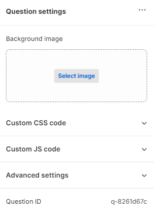
... - Opens the question management settings. Click Duplicate to duplicate the question or Remove to delete it.

Question name - Optional admin label. Gives questions an admin label (e.g. "Skin type question") that shows in the sidebar. Only visible in the builder, not shown to users.
Image upload - Click Select image and then in the popup Add image to upload a background image to this quiz question from your computer. You can also chose from existing images from your quiz gallery.
Image upload settings
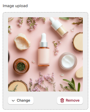
Once uploaded click ▼ Changeto change the image or 🗑 Remove to remove it.
Background image settings
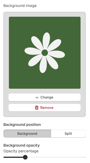
Layout - Place the image as a background or split the screen in half with the image.
Opacity - Use the slider to change opacity percentage of the uploaded image.
Split image settings
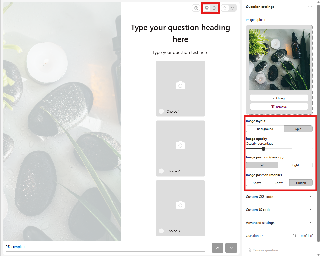
Layout - Place the image as a background or split the screen in half with the image.
Opacity - Use the slider to change opacity percentage of the uploaded image.
Position (desktop) - Choose whether the image should be placed left or right of the question on desktop.
Position (mobile) - Choose whether the image should be placed above, below a question or hidden on mobile.
Tip
Switch between the 🖥️ desktop and 📱 mobile view by clicking the desktop or mobile icon in the top right corner of the middle screen.
Tip
See how to add and adjust images for how to optimize your images.
Advanced settings - Click to expand to see advanced settings.
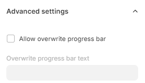
Allow overwrite progress bar - Check to be able to overwrite the default "% complete" progress bar text for this question.
Auto-advance question - Check if you want the question to automatically proceed to the next one after the selected time. Once checked you can choose the duration of the slide from the dropdown in the Auto-advance delay section. You can also chose to Hide "next" button to prevent the user from proceeding to the next question.
Note
Auto-advance feature is only available in questions without user input.
Custom CSS code - Expand to add your own custom CSS code to this section only.
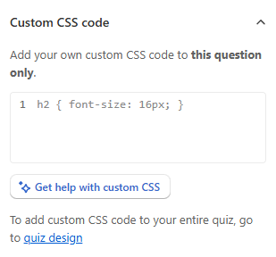
✨Get help with custom CSS - Opens a chat window with the Quiz Copilot AI. It can directly make design changes with CSS code.
Tip
To add custom CSS code to your entire quiz, go to Quiz design.
To check the CSS structure of the app, go to App CSS Structure.
Custom JS code - Expand to add your own custom JavaScript code to this section only.
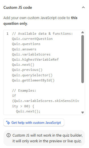
✨Get help with custom JavaScript - Opens a chat window with the Quiz Copilot AI. It can directly write JavaScript code for you.
Available JavaScript data and functions
Custom JavaScript code receives two parameters: quiz (data context) and actions (methods). See Dynamic Content & JavaScript Reference for full documentation.
Quick Reference:
// Quiz context (read-only)
quiz.currentQuestion       // Current question object
quiz.questions             // All questions array
quiz.answers.byBlock       // Answers keyed by block reference
quiz.answers.latest        // Most recent answer
quiz.variables.scores      // Variable scores { varName: number }
quiz.variables.highest     // Highest scoring variable reference
quiz.progress              // { index, displayStep, totalQuestions, percentComplete }

// Actions (methods)
actions.next()             // Go to next question
actions.previous()         // Go to previous question
actions.overrideNext('q-skintype')  // One-shot redirect
actions.updateCartAttributes({ __quiz_response_id: quiz.metadata.responseId }) // Save cart attributes
actions.setAnswer('qbi-name', 'John')  // Set answer value
actions.clearAnswer('qbi-name')        // Clear answer

// DOM helpers (shadow DOM aware)
window.quiz.querySelector('#my-element')
window.quiz.getElementById('my-element')
Example - Conditional navigation:
Example - Update element based on answer:
🗑 Remove question - Click to delete this question.
q-b72b85c0 - Click to copy the question ID to the clipboard. Displays the question ID of the selected question.
question settings / wrench icon - Opens the Question Settings menu.
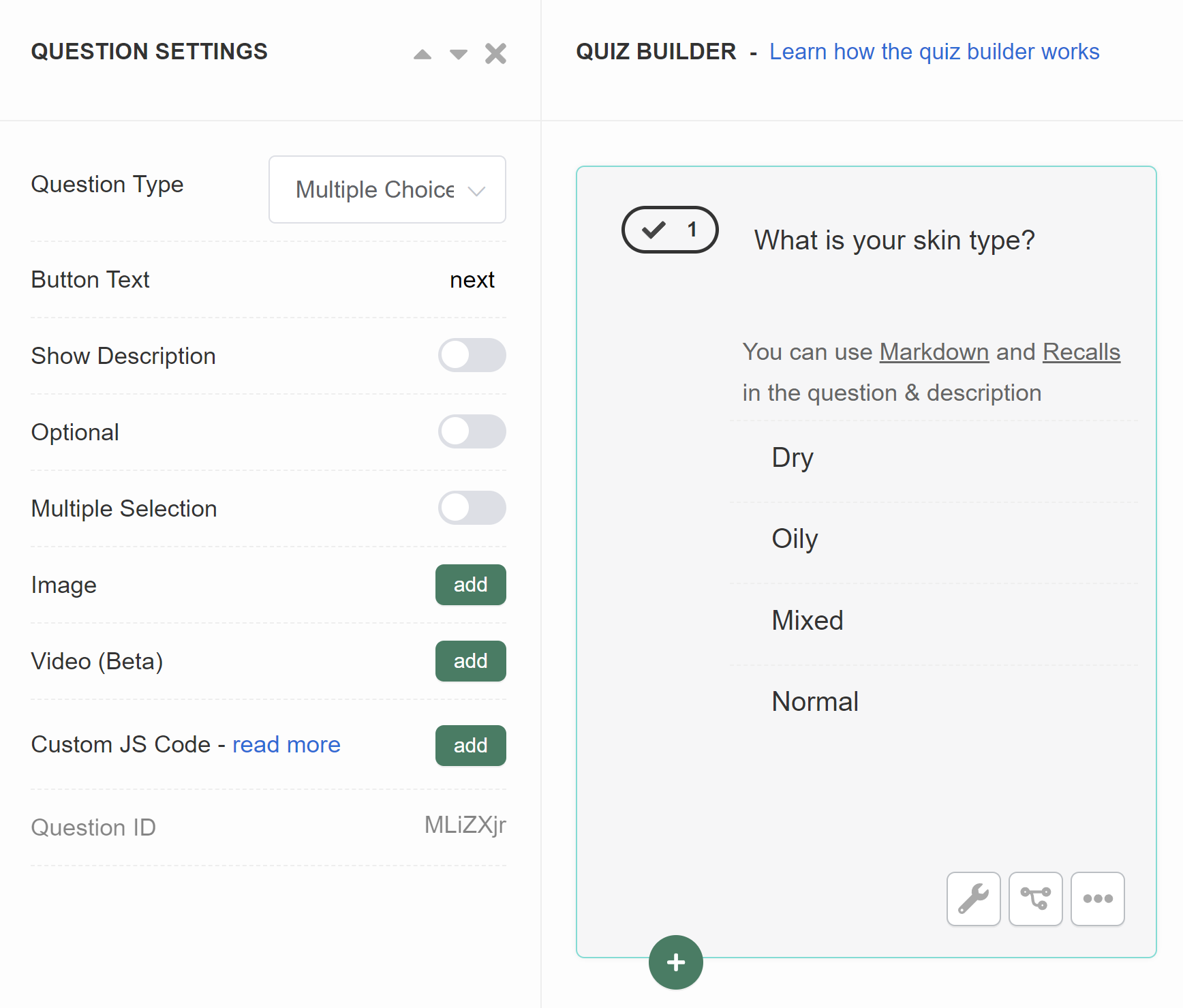
Question Type - Lets you switch between similar question types.
Button Text - Change the text button on the slide.
Recall Information - Click "recall" to add an Information Recall to the question. Read more in how to use information recalls.
Show Description - Activates an extra text field below the main question field, where you add more text to the slide. Toggle to activate.
Optional - Makes the question optional. The customer will be able to proceed without providing an answer. Toggle to activate.
Multiple Selection - Lets the customer select more than one answer. An extra menu appears once activated. Toggle to activate.
Range - Select the range of answers a customer can click.
Image - Click "Add" to upload a featured image to the question. Image should be max 1000px x 1000px. An extra menu appears once activated.
- above - Places the uploaded image above the question, on top of the slide.
- below - Places the uploaded image below the question, above the choices.
- background - Places the uploaded image on the background of the slide (overrides the default quiz background).
- split - Places the uploaded image on the side of the slide. Splits the slide into two. On mobile, the image is placed on top of the question.
- Image Opacity - A slider which lets you adjust the opacity of the uploaded image.
Video - Click "Add" to upload a featured video to the question. An extra menu appears once activated.
- responsive - Places the uploaded video as a background on the slide. The play/pause menu is active on the slide.
- widget - Places the uploaded video as a small round widget on the slide. The play/pause menu is active on the slide.
- background - Places the uploaded video as a background on the slide. The play/pause menu is deactivated.
- Video Opacity - A slider which lets you adjust the opacity of the uploaded video.
Join next question - Merges this question with the one below it, so both appear on the same slide. Chain it down a run of questions to put more than two together, and leave it off for the last one. See how to display multiple questions per slide.
Custom JS Code - Click Add to open a JavaScript console, where you add custom JavaScript to the quiz question.
Question ID - Displays the question unique ID.
conditional logic / tree icon - Opens the Conditional logic section of the Quiz Builder.
more options / ... - Opens more options menu.
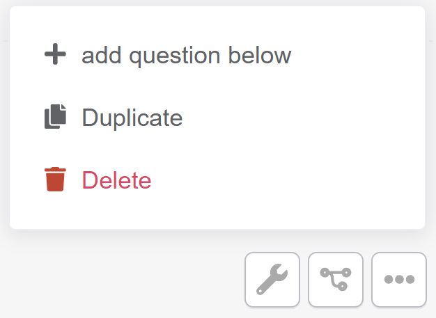
- + add question below - Adds a new blank question of the same type below.
- Duplicate - Duplicate this slide. Creates a copy slide below.
- Delete - Delete this slide.
question settings / wrench icon - Opens the Question Settings menu.
Question Type - Lets you switch between similar question types.
Button Text - Change the text button on the slide.
Recall Information - Click "recall" to add an Information Recall to the question. Read more in how to use information recalls.
Show Description - Activates an extra text field below the main question field, where you add more text to the slide. Toggle to activate.
Optional - Makes the question optional. The customer will be able to proceed without providing an answer. Toggle to activate.
Multiple Selection - Lets the customer select more than one answer. An extra menu appears once activated. Toggle to activate.
Range - Select the range of answers a customer can click.
Image - Click "Add" to upload a featured image to the question. Image should be max 1000px x 1000px. An extra menu appears once activated.
-
above - Places the uploaded image above the question, on top of the slide.
-
below - Places the uploaded image below the question, above the choices.
-
background - Places the uploaded image on the background of the slide (overrides the default quiz background).
-
split - Places the uploaded image on the side of the slide. Splits the slide into two. On mobile, the image is placed on top of the question.
-
Image Opacity - A slider which lets you adjust the opacity of the uploaded image.
Video - Click "Add" to upload a featured video to the question. An extra menu appears once activated.
-
responsive - Places the uploaded video as a background on the slide. The play/pause menu is active on the slide.
-
widget - Places the uploaded video as a small round widget on the slide. The play/pause menu is active on the slide.
-
background - Places the uploaded video as a background on the slide. The play/pause menu is deactivated.
-
Video Opacity - A slider which lets you adjust the opacity of the uploaded video.
Join next question - Merges this question with the one below it, so both appear on the same slide. Chain it down a run of questions to put more than two together, and leave it off for the last one. See how to display multiple questions per slide.
Custom JS Code - Click Add to open a JavaScript console, where you add custom JavaScript to the quiz question.
Question ID - Displays the question unique ID.
conditional logic / tree icon - Opens the Conditional logic section of the Quiz Builder.
more options / ... - Opens more options menu.
+ add question below- Adds a new blank question of the same type below.Duplicate- Duplicate this slide. Creates a copy slide below.Delete- Delete this slide.
question settings / wrench icon - Opens the Question Settings menu.
Question Type - Lets you switch between similar question types.
Button Text - Change the text button on the slide.
Recall Information - Click "recall" to add an Information Recall to the question. Read more in how to use information recalls.
Show Description - Activates an extra text field below the main question field, where you add more text to the slide. Toggle to activate.
Optional - Makes the question optional. The customer will be able to proceed without providing an answer. Toggle to activate.
Multiple Selection - Lets the customer select more than one answer. An extra menu appears once activated. Toggle to activate.
Range - Select the range of answers a customer can click.
Image - Click "Add" to upload a featured image to the question. Image should be max 1000px x 1000px. An extra menu appears once activated.
-
above- Places the uploaded image above the question, on top of the slide. -
below- Places the uploaded image below the question, above the choices. -
background- Places the uploaded image on the background of the slide (overrides the default quiz background). -
split- Places the uploaded image on the side of the slide. Splits the slide into two. On mobile, the image is placed on top of the question. -
Image Opacity- A slider which lets you adjust the opacity of the uploaded image.
Video - Click "Add" to upload a featured video to the question. An extra menu appears once activated.
-
responsive- Places the uploaded video as a background on the slide. The play/pause menu is active on the slide. -
widget- Places the uploaded video as a small round widget on the slide. The play/pause menu is active on the slide. -
background- Places the uploaded video as a background on the slide. The play/pause menu is deactivated. -
Video Opacity- A slider which lets you adjust the opacity of the uploaded video.
Join next question - Merges this question with the one below it, so both appear on the same slide. Chain it down a run of questions to put more than two together, and leave it off for the last one. See how to display multiple questions per slide.
Custom JS Code - Click Add to open a JavaScript console, where you add custom JavaScript to the quiz question.
Question ID - Displays the question unique ID.
conditional logic / tree icon - Opens the Conditional logic section of the Quiz Builder.
more options / ... - Opens more options menu.
+ add question below- Adds a new blank question of the same type below.Duplicate- Duplicate this slide. Creates a copy slide below.Delete- Delete this slide.
question settings / wrench icon - Opens the Question Settings menu.
Question Type - Lets you switch between similar question types.
Button Text - Change the text button on the slide.
Recall Information - Click "recall" to add an Information Recall to the question. Read more in how to use information recalls.
Show Description - Activates an extra text field below the main question field, where you add more text to the slide. Toggle to activate.
Optional - Makes the question optional. The customer will be able to proceed without providing an answer. Toggle to activate.
Multiple Selection - Lets the customer select more than one answer. An extra menu appears once activated. Toggle to activate.
Range - Select the range of answers a customer can click.
Image - Click "Add" to upload a featured image to the question. Image should be max 1000px x 1000px. An extra menu appears once activated.
-
above- Places the uploaded image above the question, on top of the slide. -
below- Places the uploaded image below the question, above the choices. -
background- Places the uploaded image on the background of the slide (overrides the default quiz background). -
split- Places the uploaded image on the side of the slide. Splits the slide into two. On mobile, the image is placed on top of the question. -
Image Opacity- A slider which lets you adjust the opacity of the uploaded image.
Video - Click "Add" to upload a featured video to the question. An extra menu appears once activated.
-
responsive- Places the uploaded video as a background on the slide. The play/pause menu is active on the slide. -
widget- Places the uploaded video as a small round widget on the slide. The play/pause menu is active on the slide. -
background- Places the uploaded video as a background on the slide. The play/pause menu is deactivated. -
Video Opacity- A slider which lets you adjust the opacity of the uploaded video.
Join next question - Merges this question with the one below it, so both appear on the same slide. Chain it down a run of questions to put more than two together, and leave it off for the last one. See how to display multiple questions per slide.
Custom JS Code - Click Add to open a JavaScript console, where you add custom JavaScript to the quiz question.
Question ID - Displays the question unique ID.
conditional logic / tree icon - Opens the Conditional logic section of the Quiz Builder.
more options / ... - Opens more options menu.
+ add question below- Adds a new blank question of the same type below.Duplicate- Duplicate this slide. Creates a copy slide below.Delete- Delete this slide.
question settings / wrench icon - Opens the Question Settings menu.
Question Type - Lets you switch between similar question types.
Button Text - Change the text button on the slide.
Recall Information - Click "recall" to add an Information Recall to the question. Read more in how to use information recalls.
Show Description - Activates an extra text field below the main question field, where you add more text to the slide. Toggle to activate.
Optional - Makes the question optional. The customer will be able to proceed without providing an answer. Toggle to activate.
Multiple Selection - Lets the customer select more than one answer. An extra menu appears once activated. Toggle to activate.
Range - Select the range of answers a customer can click.
Image - Click "Add" to upload a featured image to the question. Image should be max 1000px x 1000px. An extra menu appears once activated.
-
above- Places the uploaded image above the question, on top of the slide. -
below- Places the uploaded image below the question, above the choices. -
background- Places the uploaded image on the background of the slide (overrides the default quiz background). -
split- Places the uploaded image on the side of the slide. Splits the slide into two. On mobile, the image is placed on top of the question. -
Image Opacity- A slider which lets you adjust the opacity of the uploaded image.
Video - Click "Add" to upload a featured video to the question. An extra menu appears once activated.
-
responsive- Places the uploaded video as a background on the slide. The play/pause menu is active on the slide. -
widget- Places the uploaded video as a small round widget on the slide. The play/pause menu is active on the slide. -
background- Places the uploaded video as a background on the slide. The play/pause menu is deactivated. -
Video Opacity- A slider which lets you adjust the opacity of the uploaded video.
Join next question - Merges this question with the one below it, so both appear on the same slide. Chain it down a run of questions to put more than two together, and leave it off for the last one. See how to display multiple questions per slide.
Custom JS Code - Click Add to open a JavaScript console, where you add custom JavaScript to the quiz question.
Question ID - Displays the question unique ID.
conditional logic / tree icon - Opens the Conditional logic section of the Quiz Builder.
more options / ... - Opens more options menu.
+ add question below- Adds a new blank question of the same type below.Duplicate- Duplicate this slide. Creates a copy slide below.Delete- Delete this slide.
Block settings
+ Add block - Adds an extra building block to the quiz question. To remove a block, click on the 🗑 bin icon.
Info
All block elements added to a question are visible on a single slide. To add a new slide click + Add question.
Blocks are the building blocks of your quiz. Each question can have multiple blocks.
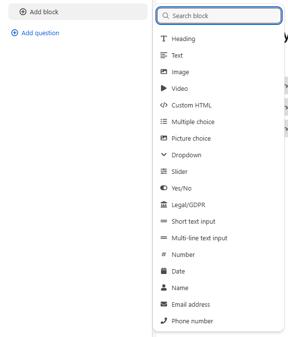
Each building block of your question has its own block settings. To open the block settings, click on the block.
🗑 / bin - Click on the bin icon to remove the block.
Button
The Next button is hidden on questions that are both single choice and mandatory. The quiz moves to the next question as soon as the customer picks a choice.
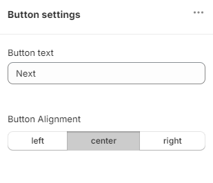
Button text - Change the default button text.
Alignment - Move the button left, right or center.
CONTENT BLOCKS
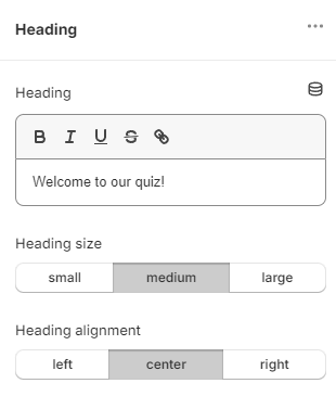
Heading
Adds a heading block to your question.
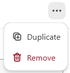
... - Opens the block management settings. Click Duplicate to duplicate the block or Remove to delete it.
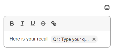
The text box lets you apply bold, cursive, underline or strikethrough to your text. You can also add links and a Content dynamic source, which recalls information from other parts of the quiz.
Liquid templates supported
Heading blocks support Liquid templates for dynamic content. Use {{ quiz.answers.byBlock['qbi-name'].value }} to display previous answers. See Dynamic Content & JavaScript Reference for all available variables.
Size - Change the size of the heading from small, medium or large.
Alignment - Change the alignment of the heading from left, center or right.
🗑 Remove block - Click to delete this block.
qbh-7327edc5 - Click to copy the block ID/ref to the clipboard. Unique identifier for the block, useful for debugging or API use.
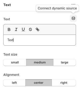
☰ / Content dynamic source - Click to open the Content Dynamic Source section. It recalls any answer the customer gave, and shows it in a Text Block or a Heading Block on the results page.
Adding a content dynamic source
To add a dynamic content source, open a Text or a Heading block and click the Dynamic content source icon.
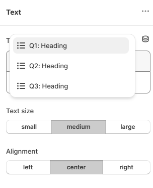
A dropdown will appear with the list of information to be recalled. Select the data point you want and it is added to the block.
Text
Adds a text block to your question.
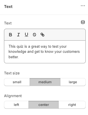
... - Opens the block management settings. Click Duplicate to duplicate the block or Remove to delete it.
The text box lets you apply bold, cursive, underline or strikethrough to your text. You can also add links and a Content dynamic source, which recalls information from other parts of the quiz.
Liquid templates supported
Text blocks support Liquid templates for dynamic content. Use {{ quiz.answers.byBlock['qbi-name'].value }} to display previous answers. See Dynamic Content & JavaScript Reference for all available variables.
Size - Change the size of the text from small, medium or large.
Alignment - Change the alignment of the text from left, center or right.
🗑 Remove block - Click to delete this block.
qbt-7327edc5 - Click to copy the block ID/ref to the clipboard. Unique identifier for the block, useful for debugging or API use.
☰ / Content dynamic source - Click to open the Content Dynamic Source section. It recalls any answer the customer gave, and shows it in a Text Block or a Heading Block on the results page.
Adding a content dynamic source
To add a dynamic content source, open a Text or a Heading block and click the Dynamic content source icon.
A dropdown will appear with the list of information to be recalled. Select the data point you want and it is added to the block.
Image
Adds an image block to the question.
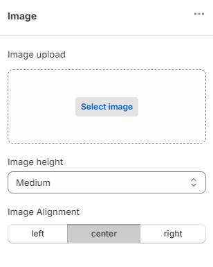
... - Opens the block management settings. Click Duplicate to duplicate the block or Remove to delete it.
Click Select image to upload an image from your computer or pick one from your in-app image gallery. Once uploaded, click Change to replace the image or Remove to delete it.
Add in Alt text to make the image more accessible. Note: Alt text is used by screen readers to describe the image to visually impaired users.
Height - You can adjust the image size in the Image heightdropdown.
Alignment changes the alignment of the image to left, right or center.
🗑 Remove block - Click to delete this block.
qbi-9907ff50 - Click to copy the block ID/ref to the clipboard. Unique identifier for the block, useful for debugging or API use.
Video
Adds a video block to your question.
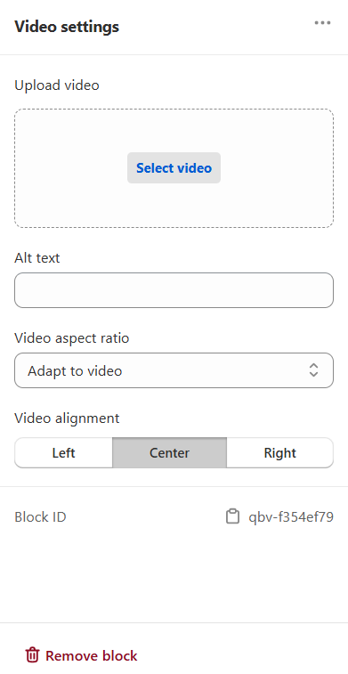
... - Opens the block management settings. Click Duplicate to duplicate the block or Remove to delete it.
Select video - Upload a video from your computer.
Alt text - Add a short description of the video (for accessibility).
Video aspect ratio - Choose how the video is sized (for example horizontal, vertical, 16:9, 4:3).
Video alignment - Set the video position: Left, Center, or Right.
🗑 Remove block - Click to delete this block.
qbv-9a4456f8 - Click to copy the block ID/ref to the clipboard. Unique identifier for the block, useful for debugging or API use.
Custom HTML
Adds a custom HTML block question to this block.
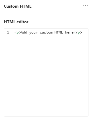
... - Opens the block management settings. Click Duplicate to duplicate the block or Remove to delete it.
HTML editor - Code box where you can input your custom code.
Liquid templates and JavaScript supported
Custom HTML blocks support both Liquid templates and JavaScript. Use Liquid for dynamic content (e.g., {{ quiz.answers.byBlock['qbi-name'].value }}). JavaScript in <script> tags will execute and has access to the quiz and actions objects. See Dynamic Content & JavaScript Reference for all available variables and methods.
Example with Liquid:
<div class="greeting">
  {% if quiz.answers.byBlock['qbi-name'] %}
    Hello, {{ quiz.answers.byBlock['qbi-name'].value }}!
  {% else %}
    Welcome to our quiz!
  {% endif %}
</div>
Example with JavaScript:
🗑 Remove block - Click to delete this block.
qbhtml-d415c4dc - Click to copy the block ID/ref to the clipboard. Unique identifier for the block, useful for debugging or API use.
CHOICES BLOCKS
Multiple choice
Adds a multiple-choice block to your question.
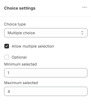
... - Opens the block management settings. Click ⿻ Duplicate to duplicate the block or 🗑 Remove to delete it.
Optional - Make a question optional (no answer needs to be give to proceed to the next question).
Allow multiple selection - Allow for more than one answer to be selected in this block. Checking this option activates the Minimum selected and Maximum selected settings. Minimum selected - the smallest number of choices needed before the customer can go to the next question. Maximum selected - the largest number of choices that can be selected. Above that, the customer cannot move on to the next question. Error message - the message shown to the customer when they select too many options.
🗑 Remove block - Click to delete this block.
qbc-d415c4dc - Click to copy the block ID/ref to the clipboard. Unique identifier for the block, useful for debugging or API use.
Picture choice
Adds a picture choice block to your question.
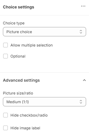
... - Opens the block management settings. Click Duplicate to duplicate the block or Remove to delete it.
Optional - Make a question optional (no answer needs to be give to proceed to the next question).
Allow multiple selection - Allow for more than one answer to be selected in this block. Checking this option activates the Error message, Minimum selected and Maximum selected settings. Minimum selected - the fewest choices the customer must select to go to the next question. Maximum selected - the most choices the customer can select. Above that number, they cannot go on.Error message - add a message to the user if they select too many options.
Advanced settings - Opens the advanced choice settings menu.
Picture size/ratio - Choose the picture size for this block. Choose between Tiny icon (24px), Small icon (48px), Medium (1:1) or Large (4:3) picture size.
If you select Medium (1:1) in the Picture size/ratio dropdown, an extra option for choosing a Mobile layout appears. There you can choose how this block will be displayed on mobile devices - either as a Carousel, One per row or Two per row.
Hide checkbox/radio - When checked hides the checkbox element from picture choices.
Hide image label - when checked hides the text below each picture choice.
Fit full image in box (no cropping) - When checked, the image will be displayed in the box without cropping.
Tip
🗑 Remove block - Click to delete this block.
qbc-d415c4dc - Click to copy the block ID/ref to the clipboard. Unique identifier for the block, useful for debugging or API use.
Dropdown
Adds a dropdown block to your question.
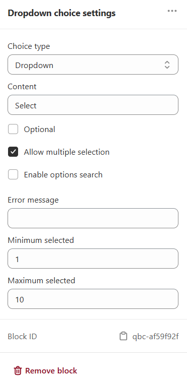
... - Opens the block management settings. Click Duplicate to duplicate the block or Remove to delete it.
Content - Label shown above the dropdown.
Optional - Check if the question can be skipped.
Allow multiple selection - Allow for more than one answer to be selected in this block. Checking this option activates the Minimum selected and Maximum selected settings. Minimum selected - the fewest choices the customer must select to go to the next question. Maximum selected - the most choices the customer can select. Above that number, they cannot go on.
Enable options search - Adds a search bar inside the dropdown.
Error message - Custom message shown if the rules are not followed.
Minimum selected - Minimum number of options the user must pick.
Maximum selected - Maximum number of options allowed.
🗑 Remove block - Click to delete this block.
qbc-d415c4dc - Click to copy the block ID/ref to the clipboard. Unique identifier for the block, useful for debugging or API use.
Slider bar
Adds a slider block to your question.
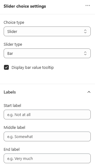
... - Opens the block management settings. Click Duplicate to duplicate the block or Remove to delete it.
Display bar value tooltip - Check if you want to see the labels with each value.
Optional - Make a question optional (no answer needs to be give to proceed to the next question).
Labels - Unfold to add (type in) the labels to each step in the slider.
🗑 Remove block - Click to delete this block.
qbc-4d197782 - Click to copy the block ID/ref to the clipboard. Unique identifier for the block, useful for debugging or API use.
Buttons scale
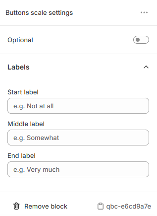
... - Opens the block management settings. Click Duplicate to duplicate the block or Remove to delete it.
Optional - Make a question optional (no answer needs to be give to proceed to the next question).
🗑 Remove block - Click to delete this block.
qbc-4134de48 - Click to copy the block ID/ref to the clipboard. Unique identifier for the block, useful for debugging or API use.
Rating scale
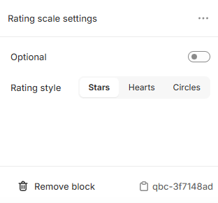
... - Opens the block management settings. Click Duplicate to duplicate the block or Remove to delete it.
Optional - Make a question optional (no answer needs to be give to proceed to the next question).
🗑 Remove block - Click to delete this block.
qbc-7eb5bf2c - Click to copy the block ID/ref to the clipboard. Unique identifier for the block, useful for debugging or API use.
Yes/no
Adds a yes/no block to your question.
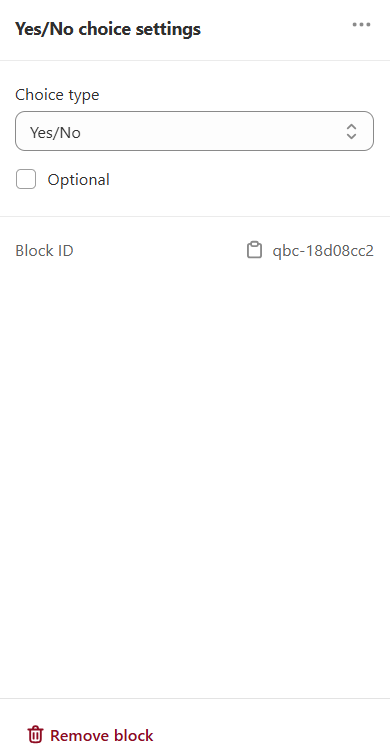
... - Opens the block management settings. Click Duplicate to duplicate the block or Remove to delete it.
Optional - Check if the question can be skipped.
🗑 Remove block - Click to delete this block.
qbc-4134de48 - Click to copy the block ID/ref to the clipboard. Unique identifier for the block, useful for debugging or API use.
Legal/GDPR
Adds a legal/GDPR block to your question.
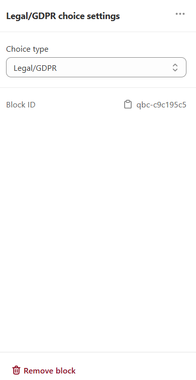
... - Opens the block management settings. Click Duplicate to duplicate the block or Remove to delete it.
🗑 Remove block - Click to delete this block.
qbc-54257a2e - Click to copy the block ID/ref to the clipboard. Unique identifier for the block, useful for debugging or API use.
INPUT BLOCKS
Short text input
Adds an open-text question to this block.
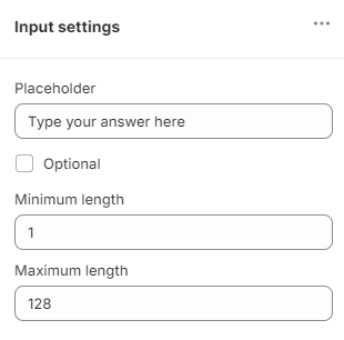
... - Opens the block management settings. Click Duplicate to duplicate the block or Remove to delete it.
Input type - Switch between Short text or Long text input type.
Placeholder - The default text displayed in the textbox visible to the customer.
Optional - Make a question optional (no answer needs to be give to proceed to the next question).
Error message - Add a default error message in case entered text is too short or too long.
Minimum length - set a minimum number of characters required in this question answer.
Maximum length - set a maximum number of characters required in this question answer.
🗑 Remove block - Click to delete this block.
qbi-9a4456f8 - Click to copy the block ID/ref to the clipboard. Unique identifier for the block, useful for debugging or API use.
Multi-line text input
Adds an open-text question to this block.

... - Opens the block management settings. Click Duplicate to duplicate the block or Remove to delete it.
Placeholder - The default text displayed in the textbox visible to the customer.
Optional - Make a question optional (no answer needs to be give to proceed to the next question).
Error message - Add a default error message in case entered text is too short or too long.
Minimum length - set a minimum number of characters required in this question answer.
Maximum length - set a maximum number of characters required in this question answer.
🗑 Remove block - Click to delete this block.
qbi-9a4456f8 - Click to copy the block ID/ref to the clipboard. Unique identifier for the block, useful for debugging or API use.
Number
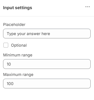
... - Opens the block management settings. Click Duplicate to duplicate the block or Remove to delete it.
Placeholder - The default text displayed in the textbox visible to the customer.
Optional - Make a question optional (no answer needs to be give to proceed to the next question).
Error message - Add a default error message in case entered text is too short or too long.
Minimum range - the minimum number value that can be entered.
Maximum range - the maximum number value that can be entered.
🗑 Remove block - Click to delete this block.
qbi-9a4456f8 - Click to copy the block ID/ref to the clipboard. Unique identifier for the block, useful for debugging or API use.
Product recommendation
Number fields accept any value, so the quiz cannot match them to products. Instead, define numeric ranges, for example 0-10 and 11-50, with a multiple-choice, dropdown or slider question, then link products to each range. See how to recommend products based on numerical inputs
Date
Adds a date question to this block.
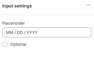
... - Opens the block management settings. Click Duplicate to duplicate the block or Remove to delete it.
Date format - The default date format customer should enter.
Optional - Make a question optional (no answer needs to be give to proceed to the next question).
Error message - Add a default error message in case entered text is incorrect.
🗑 Remove block - Click to delete this block.
qbi-9a4456f8 - Click to copy the block ID/ref to the clipboard. Unique identifier for the block, useful for debugging or API use.
Product recommendation
Date fields accept any value, so the quiz cannot match them to products. Instead, define date ranges, for example 01/01/2020-01/01/2021, with a multiple-choice, dropdown or slider question, then link products to each range. See how to recommend products based on numerical inputs
Name
Adds an name input question to this block.
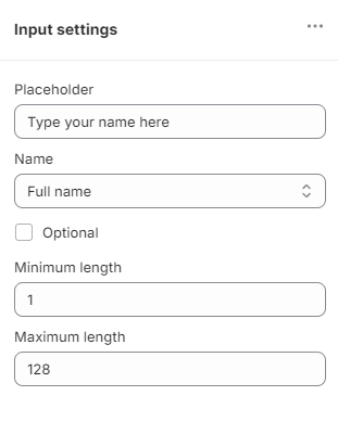
... - Opens the block management settings. Click Duplicate to duplicate the block or Remove to delete it.
Name - Select whether you want to ask for the Full Name, First Name or Last Name.
Placeholder - The default text displayed in the textbox visible to the customer.
Optional - Make a question optional (no answer needs to be give to proceed to the next question).
Error message - Add a default error message in case entered text is too short or too long.
Minimum length - set a minimum number of characters required in this question answer.
Maximum length - set a maximum number of characters required in this question answer.
🗑 Remove block - Click to delete this block.
qbi-9a4456f8 - Click to copy the block ID/ref to the clipboard. Unique identifier for the block, useful for debugging or API use.
Email address
Adds an email input question to this block.
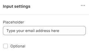
... - Opens the block management settings. Click Duplicate to duplicate the block or Remove to delete it.
Placeholder - The default text displayed in the textbox visible to the customer.
Optional - Make a question optional (no answer needs to be give to proceed to the next question).
Error message - Add a default error message in case entered text is incorrect.
🗑 Remove block - Click to delete this block.
qbi-9a4456f8 - Click to copy the block ID/ref to the clipboard. Unique identifier for the block, useful for debugging or API use.
Phone number
Adds a phone number question to this block.
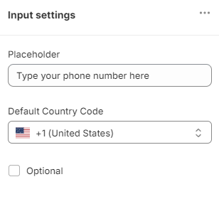
... - Opens the block management settings. Click Duplicate to duplicate the block or Remove to delete it.
Default Country Code - Select a default country code from the dropdown list.
Placeholder - The default text displayed in the textbox visible to the customer.
Optional - Make a question optional (no answer needs to be give to proceed to the next question).
Error message - Add a default error message in case entered text is incorrect.
🗑 Remove block - Click to delete this block.
qbi-9a4456f8 - Click to copy the block ID/ref to the clipboard. Unique identifier for the block, useful for debugging or API use.
CHART BLOCKS
Gauge chart
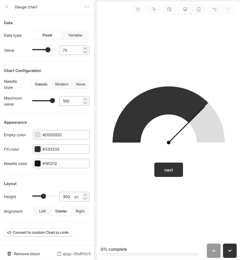
... - Opens the block management settings. Click Duplicate to duplicate the block or Remove to delete it.
Data
Data type - Select the data type to be displayed in the chart between Fixed or Variable. If you select Variable, you can select a variable from the dropdown list.
Value - Set the value to be displayed in the chart.
Chart Configuration
Needle style - Select the needle style to be displayed in the chart between Classic, Modern or None.
Maxiumum value - Set the maximum value to be displayed in the chart.
Appearance
Empty color - Set the color to be displayed in the chart when the value is 0.
Fill color - Set the color to be displayed in the chart when the value is not 0.
Needle color - Set the color to be displayed in the needle.
Layout
Height - Set the height of the chart.
Alignment - Set the alignment of the chart between Left, Center or Right.
Convert to custom Chart.js code - Convert the chart to a custom Chart.js code and edit the code to customize the chart.
🗑 Remove block - Click to delete this block.
qbgc-070101fa - Click to copy the block ID/ref to the clipboard. Unique identifier for the block, useful for debugging or API use.
Radar chart
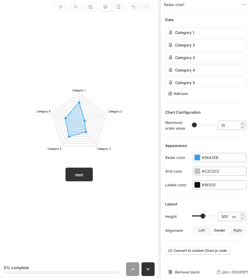
... - Opens the block management settings. Click Duplicate to duplicate the block or Remove to delete it.
Data
Category 1 - Set the category name for the first axis.
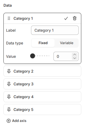
Label - Set the label for the first axis.
Data type - Select the data type to be displayed in the chart between Fixed or Variable. If you select Variable, you can select a variable from the dropdown list.
Value - If you select Fixed, set the value to be displayed in the chart.
Category 2 - Set the category name for the second axis.
Category 3 - Set the category name for the third axis.
Category 4 - Set the category name for the fourth axis.
Category 5 - Set the category name for the fifth axis.
+ Add axis - Click to add a new axis.
Chart Configuration
Maximum scale value - Set the maximum value to be displayed in the chart.
Appearance
Radar color - Set the color to be displayed in the radar.
Grid color - Set the color to be displayed in the grid.
Labels color - Set the color to be displayed in the labels.
Layout
Height - Set the height of the chart.
Alignment - Set the alignment of the chart between Left, Center or Right.
Convert to custom Chart.js code - Convert the chart to a custom Chart.js code and edit the code to customize the chart.
🗑 Remove block - Click to delete this block.
qbrc-070101fa - Click to copy the block ID/ref to the clipboard. Unique identifier for the block, useful for debugging or API use.
Bar chart
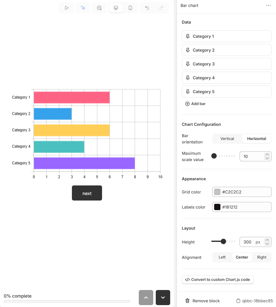
... - Opens the block management settings. Click Duplicate to duplicate the block or Remove to delete it.
Data
Category 1 - Set the category name for the first axis.
Label - Set the label for the first axis.
Data type - Select the data type to be displayed in the chart between Fixed or Variable. If you select Variable, you can select a variable from the dropdown list.
Value - If you select Fixed, set the value to be displayed in the chart.
Category 2 - Set the category name for the second axis.
Category 3 - Set the category name for the third axis.
Category 4 - Set the category name for the fourth axis.
Category 5 - Set the category name for the fifth axis.
+ Add axis - Click to add a new axis.
Chart Configuration
Bar orientation - Set the orientation of the bar between Vertical or Horizontal.
Maximum scale value - Set the maximum value to be displayed in the chart.
Appearance
Grid color - Set the color to be displayed in the grid.
Labels color - Set the color to be displayed in the labels.
Layout
Height - Set the height of the chart.
Alignment - Set the alignment of the chart between Left, Center or Right.
Convert to custom Chart.js code - Convert the chart to a custom Chart.js code and edit the code to customize the chart.
🗑 Remove block - Click to delete this block.
qbrc-070101fa - Click to copy the block ID/ref to the clipboard. Unique identifier for the block, useful for debugging or API use.
Rating display
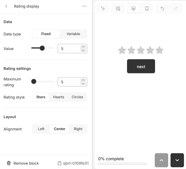
... - Opens the block management settings. Click Duplicate to duplicate the block or Remove to delete it.
Data
Data type - Select the data type to be displayed in the chart between Fixed or Variable. If you select Variable, you can select a variable from the dropdown list.
Value - Set the value to be displayed in the chart.
Rating settings
Maximum rating - Set the maximum rating to be displayed in the chart.
Rating style - Select the rating style to be displayed in the chart between Stars, Hearts or Circles.
Layout
Alignment - Set the alignment of the chart between Left, Center or Right.
🗑 Remove block - Click to delete this block.
qbrt-070101fa - Click to copy the block ID/ref to the clipboard. Unique identifier for the block, useful for debugging or API use.
Custom chart
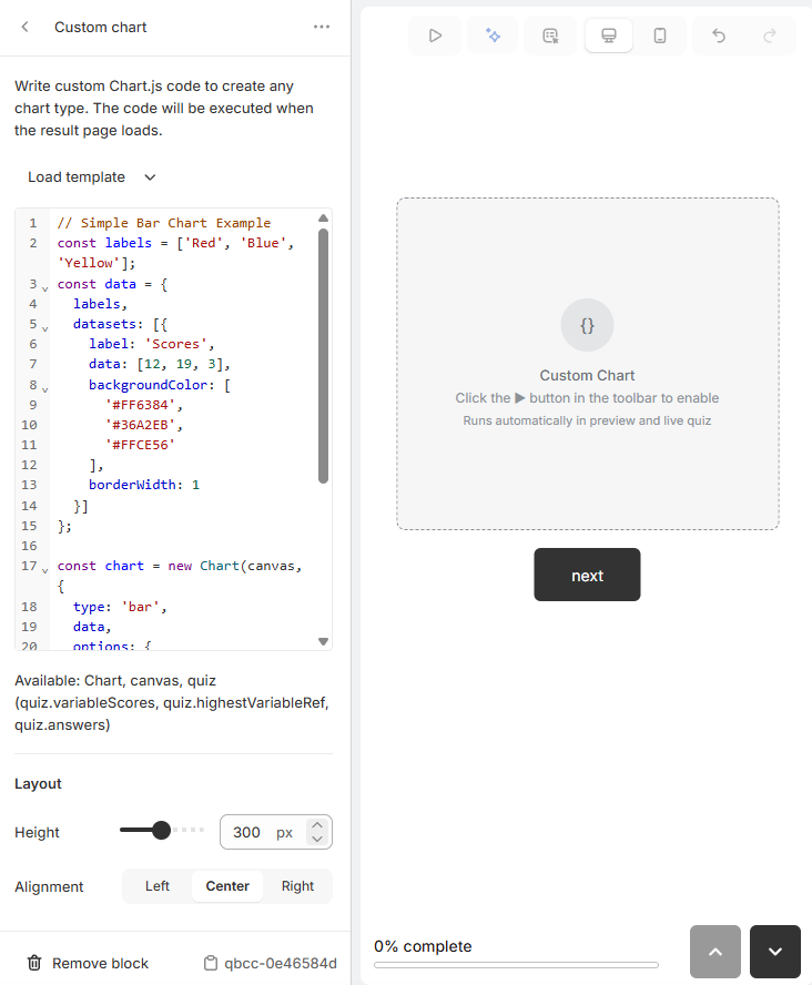
... - Opens the block management settings. Click Duplicate to duplicate the block or Remove to delete it.
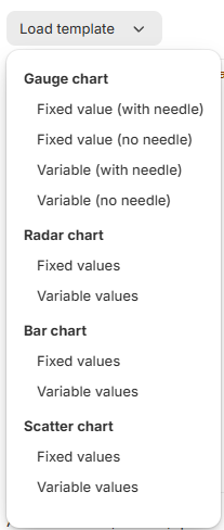
Load template - Select a chart template code from the dropdown list.
Layout
Height - Set the height of the chart.
Alignment - Set the alignment of the chart between Left, Center or Right.
🗑 Remove block - Click to delete this block.
qbcc-070101fa - Click to copy the block ID/ref to the clipboard. Unique identifier for the block, useful for debugging or API use.
Set a question's type, its text, its image and its options in Question settings.
A slide holds one question by default. To put several questions on the same
slide, use Join next question, as
how to join questions describes.
Set a question's type, its text, its image and its options in Question settings.
A slide holds one question by default. To put several questions on the same
slide, use Join next question, as
how to join questions describes.
Set a question's type, its text, its image and its options in Question settings.
A slide holds one question by default. To put several questions on the same
slide, use Join next question, as
how to join questions describes.
Set a question's type, its text, its image and its options in Question settings.
A slide holds one question by default. To put several questions on the same
slide, use Join next question, as
how to join questions describes.
Set a question's type, its text, its image and its options in Question settings.
A slide holds one question by default. To put several questions on the same
slide, use Join next question, as
how to join questions describes.
Choice settings
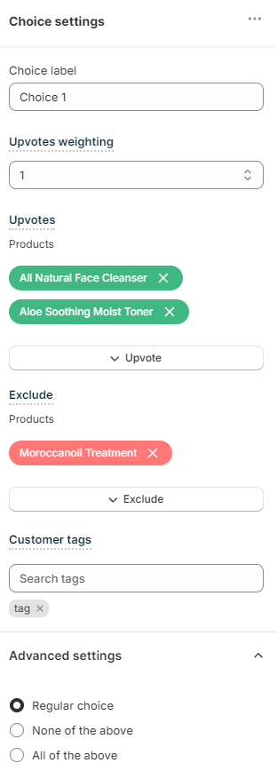
... - Opens the choice management settings. Click Duplicate to duplicate the choice or Remove to delete it.
Choice label - The text shown on the choice. Supports HTML formatting (<strong>, <em>) and Liquid templates for personalization, for example {{ quiz.answers.byBlock['qbi-name'].value }}. Dropdown choices strip HTML to plain text for accessibility.
Choice image - Shows the image displayed in this picture choice. CLick Select image to upload an image for this choice or choose from the in-app image gallery.
Upvotes weighting - Sets a default weight of this choice. If the weight is set to 2, all the upvoted products will receive x2 (double) upvotes from this choice.
Upvotes
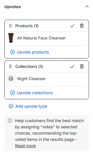
Upvotes - lists all the products, product variants, collections, tags, variants collections or vendors that are linked to this choice.
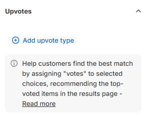
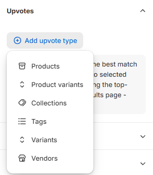
+ Add upvote type - Click to choose an item to upvote. You can upvote individual products, product variants or entire collections, tags, variants collections or vendors to a choice.
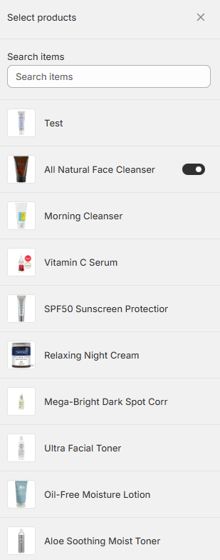
A new section then opens, where you pick items from your Shopify catalog to link to this choice.
Exclude
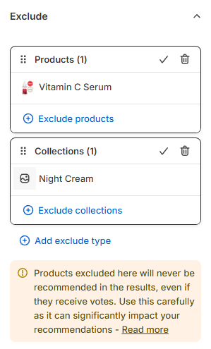
Exclude - lists all the products, product variants, collections, tags, variants collections or vendors that are excluded in this choice.
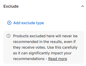
+ Add exclude type - Click to choose an item to exclude. You can exclude individual products, product variants or entire collections, tags, variants collections or vendors from a choice.
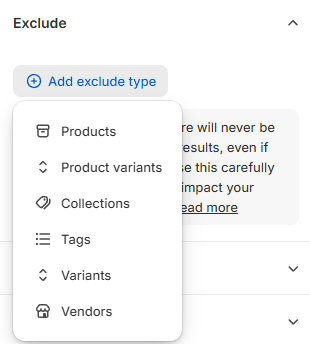
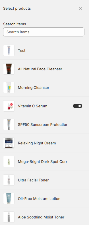
A new section then opens, where you pick items from your Shopify catalog to exclude from this choice.
Customer tags
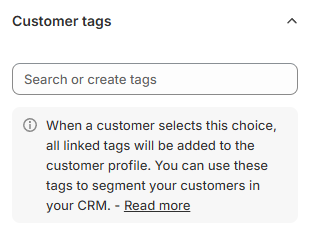
Search or create tags - Click to search for a tag to link to this choice or start typing the name to create a new tag.
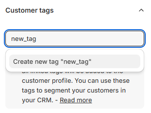
All the tags you create will be visible at the bottom in grey.

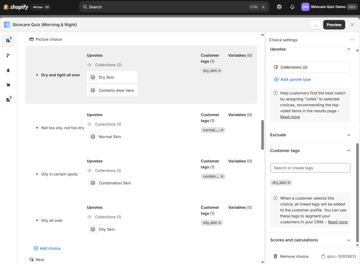
When as customer selects this choice, all the linked tags will be added to the customer profile. You can use these tags to segment your customers in your CRM.
Scores and calculations
Scores and calculations – Add points to a variable when this choice is selected. Use scores to show different results based on total points.

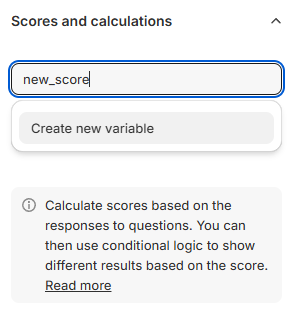
Search or create variables - Connect or create variables to this choice for custom logic (for advanced scoring or conditions). To create a new variable, start typing the name of the variable you want to create, for example dry_skin, normal_skin or oily_skin. Once you have typed the full name, a dropdown appears with Create a new variable "xxx". Click on it to add a new variable.
Advanced settings
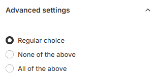
Advanced settings - Opens the advanced choice settings menu.
Note
Available only if Allow multiple selection is active in Multiple-Choice Block settings.
Regular choice - Regular choice type.
None of the above - If the choice is this type and it is selected, it will disable all the other choices.
All of the above - If the choice is this type and it is selected, it automatically selects every choice in that question.
🗑 Remove choice - Click to delete this choice.
qbcc-1ad6b5ea - Click to copy the choice ID/ref to the clipboard. Unique identifier for the choice, useful for debugging or API use.
Set what a choice does from the Quiz Builder side menu. Link Collections and Link Products control the products a choice upvotes. Customer Tags controls the tags it applies to the customer.
Set what a choice does from the Quiz Builder side menu. Link Collections and Link Products control the products a choice upvotes. Customer Tags controls the tags it applies to the customer.
Set what a choice does from the Quiz Builder side menu. Link Collections and Link Products control the products a choice upvotes. Customer Tags controls the tags it applies to the customer.
Set what a choice does from the Quiz Builder side menu. Link Collections and Link Products control the products a choice upvotes. Customer Tags controls the tags it applies to the customer.
Set what a choice does from the Quiz Builder side menu. Link Collections and Link Products control the products a choice upvotes. Customer Tags controls the tags it applies to the customer.
Dynamic content & JavaScript reference
This section provides a complete reference for dynamic content using Liquid templates and JavaScript in quiz questions.
Liquid templates
Liquid is a templating language. It lets you show dynamic content based on quiz answers and variables. It is supported in:
- Heading blocks - Personalize titles
- Text blocks - Dynamic paragraphs
- Custom HTML blocks - Full template control
- Choice labels - Personalized answer options (HTML auto-stripped for dropdowns)
The quiz object
All Liquid templates have access to the quiz object with the following properties:
| Property | Type | Description |
|---|---|---|
quiz.id |
string | Quiz identifier |
quiz.mode |
string | Always 'question' on question pages |
quiz.currentQuestion |
object | Current question data |
quiz.questions |
array | All quiz questions |
quiz.results |
array | All results pages |
Accessing answers
| Property | Description |
|---|---|
quiz.answers.list |
Array of all answers in chronological order |
quiz.answers.byBlock['ref'] |
Answer object keyed by block reference |
quiz.answers.byQuestion['ref'] |
Answers grouped by question reference |
quiz.answers.latest |
Most recent answer |
Each answer object contains:
| Property | Description |
|---|---|
.value |
The answer value (string) |
.blockRef |
Block reference ID |
.questionRef |
Question reference ID |
.choicesRefs |
Array of selected choice IDs |
.isValid |
Whether answer passed validation |
Variables & scoring
| Property | Description |
|---|---|
quiz.variables.scores |
Object with variable scores { varName: number } |
quiz.variables.highest |
Reference of highest-scoring variable |
Progress (question mode)
| Property | Description |
|---|---|
quiz.progress.index |
0-based question index |
quiz.progress.displayStep |
1-based step number (for display) |
quiz.progress.totalQuestions |
Total number of questions |
quiz.progress.percentComplete |
Completion percentage (0-100) |
quiz.progress.hasPrevious |
Can navigate back |
quiz.progress.hasNext |
Can navigate forward |
Liquid examples
Display previous answer:
{% if quiz.answers.byBlock['qbi-name'] %}
  Hello, {{ quiz.answers.byBlock['qbi-name'].value }}!
{% endif %}
Show progress:
Conditional content based on score:
{% assign sensitivity = quiz.variables.scores.sensitive | default: 0 %}
{% if sensitivity > 50 %}
  Based on your answers, you have sensitive skin.
{% endif %}
JavaScript API
Custom JavaScript code receives two parameters: quiz (read-only context) and actions (methods).
Quiz context properties
The quiz parameter contains all the data from the Liquid context above, plus:
| Property | Description |
|---|---|
quiz.metadata.responseId |
Unique response identifier |
quiz.metadata.language |
Quiz language code |
quiz.metadata.inBuilder |
true if in builder preview |
quiz.metadata.isStoreRenderer |
true when the quiz renders inside the storefront, where the Shopify Ajax cart endpoints are reachable |
Actions (methods)
| Method | Description |
|---|---|
actions.next() |
Navigate to next question |
actions.previous() |
Navigate to previous question |
actions.overrideNext(ref) |
Redirect to specific question/result (e.g., 'q-skintype', 'r-results') |
actions.setAnswer(blockRef, value) |
Set answer value |
actions.setAnswers(obj) |
Batch update multiple answers |
actions.clearAnswer(blockRef) |
Clear an answer |
actions.removeAnswer(blockRef) |
Remove answer completely |
actions.updateCartAttributes(attrs) |
Write attributes onto the Shopify cart |
DOM helpers
Since the quiz may render in a shadow DOM, use these helpers instead of document.querySelector:
| Method | Description |
|---|---|
window.quiz.querySelector(selector) |
Find element in quiz |
window.quiz.querySelectorAll(selector) |
Find all matching elements |
window.quiz.getElementById(id) |
Find element by ID |
Global event handler
window.quiz.onChange = (event) => {
  // event.blockRef - Block that changed
  // event.value - New value
  // event.selectedLabel - Label of selected choice
};
JavaScript examples
Conditional navigation based on score:
Update element based on answer:
const name = quiz.answers.byBlock['qbi-name']?.value || 'Guest';
const el = window.quiz.getElementById('greeting');
if (el) el.textContent = `Welcome, ${name}!`;
Auto-advance based on selection:
window.quiz.onChange = (event) => {
  if (event.blockRef === 'qbc-skintype' && event.selectedLabel === 'Oily') {
    actions.overrideNext('q-oily-concerns');
  }
};
Batch update answers:
Add your own JavaScript to the quiz with how to add JavaScript, and your own CSS with how to customize the quiz design. To show a customer's own answers back to them, see how to use information recalls.
Add your own JavaScript to the quiz with how to add JavaScript, and your own CSS with how to customize the quiz design. To show a customer's own answers back to them, see how to use information recalls.
Add your own JavaScript to the quiz with how to add JavaScript, and your own CSS with how to customize the quiz design. To show a customer's own answers back to them, see how to use information recalls.
Add your own JavaScript to the quiz with how to add JavaScript, and your own CSS with how to customize the quiz design. To show a customer's own answers back to them, see how to use information recalls.
Add your own JavaScript to the quiz with
[how to add JavaScript](/how-to-guides/add-javascript/), and your own CSS with
[how to customize the quiz design](/how-to-guides/customize-quiz-design/).
To show a customer's own answers back to them, see
[how to use information recalls](/how-to-guides/use-information-recalls/).